A Practical Guide to Analytics Documentation That Gets Used
Stop data chaos. Learn the process to create, govern, and maintain analytics documentation your team will actually use. A guide for modern data teams.
https://www.youtube.com/watch?v=LbSAG5aoKh0
published
Outrank AI
analytics documentation, data governance, data dictionary, self-service analytics, data management
ababf9b8-b0cf-40a0-a401-a3b59447d31b

A product manager asks for monthly active users before the board meeting. One analyst pulls from the product dashboard. Another uses a finance model. A third queries the warehouse directly. All three numbers are defensible. None of them match.
That moment tells you almost everything about the state of your analytics function. The problem usually isn't SQL quality. It isn't dashboarding capacity either. It's that the company has no shared memory for what the numbers mean, where they come from, who owns them, and when they changed.
Teams respond by creating more pages in Confluence or Notion. Then those pages age out, trust drops, and everyone goes back to Slack. Good analytics documentation fixes that only when it operates as a system inside the workflow, not as a side project parked in a wiki.
Table of Contents
Why Documentation Is Your Highest Leverage Investment
When people say they want self-serve analytics, what they usually mean is that they want fewer arguments about basic definitions and fewer waits for routine answers. That doesn't happen because you bought a better BI tool. It happens when the company agrees on language.

Without analytics documentation, every request becomes a small negotiation. Does “active” mean app open, meaningful action, or paid account usage. Does revenue include refunds. Is churn measured by logo, seat, or contract value. A fast-moving startup can survive that ambiguity for a while, but it compounds as more teams rely on the same data.
The cost isn't only wrong numbers. The deeper cost is hesitation. Product managers stop trusting dashboards. Finance builds parallel sheets. Executives ask analysts to manually validate every chart. Analysts become a human translation layer instead of building durable systems. That's the opposite of a real data democratization strategy.
Shared definitions create speed
A documentation culture gives the company a stable operating model for analytics. People know which metrics are certified, which tables are safe to use, and where edge cases are recorded. The result is less rework and fewer duplicate analyses.
Documentation also improves decision quality in a less obvious way. It forces the team to expose assumptions. If two dashboards define activation differently, that difference is no longer hidden in SQL. It's visible and discussable.
Practical rule: If a metric influences roadmap, pricing, hiring, or investor reporting, it needs written ownership and a written definition.
Trust is built before the dashboard is opened
Leaders often invest in dashboards first and documentation later. In practice, that order fails. A dashboard with unclear logic scales confusion faster. A documented metric scales trust.
The most impactful action isn't “document everything.” It's documenting the points where interpretation changes outcomes. Start with executive KPIs, product health metrics, core revenue logic, and the source tables that feed them. Once those are stable, self-service becomes realistic because people aren't browsing data blind. They're operating inside a shared map.
The Four Pillars of Analytics Documentation
A strong analytics documentation system isn't one artifact. It's a stack of connected records that answer different questions for different users. If you collapse them into one generic wiki page, nobody gets what they need.
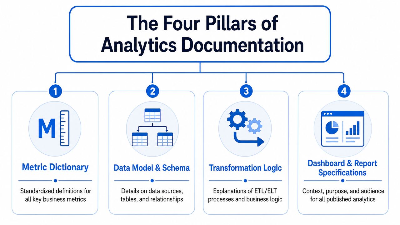
What each pillar solves
The first pillar is the metric dictionary, containing the business definition. It should explain what a metric means in plain English, the business intent behind it, the calculation logic, exclusions, grain, owner, and certification status. If your CEO asks what “qualified pipeline” means, this is the answer.
The second pillar is the data dictionary. This works at the schema level. It documents tables, columns, data types, expected values, joins, and caveats. Analysts need this to use the warehouse safely. Data engineers need it to reduce repeated questions about source models.
The third pillar is the event schema. Product and marketing teams rely on behavioral data, and behavioral data breaks when event names drift or properties get reused inconsistently. Event schema docs define each event, property, trigger conditions, and implementation notes. This is the guardrail between “we track usage” and “we have noise.”
The fourth pillar is data lineage. This shows how data flows from source systems through transformations into marts, dashboards, and reports. When a number changes unexpectedly, lineage tells you where to investigate. It also tells new team members which layer they're looking at.
Here is the quick-reference view commonly required:
Component | What It Is | Typical Owner | Example Use Case |
|---|---|---|---|
Metric Dictionary | Business definitions and calculation rules for KPIs | Analytics engineer, product analyst, or finance analyst | Defining monthly active users for product reviews and board reporting |
Data Dictionary | Table and column descriptions, joins, caveats, and intended usage | Data engineer or analytics engineer | Explaining which customer table is canonical |
Event Schema | Documentation for events, properties, trigger logic, and tracking conventions | Product analyst, analytics engineer, or product manager with engineering support | Standardizing |
Data Lineage | Visual or documented flow from source to transformation to dashboard | Data engineer or analytics engineer | Tracing a broken retention dashboard back to a source change |
A short explainer can help teams internalize the stack before they start building:
Where teams usually get stuck
Most documentation failures come from category confusion. Teams write a metric definition where a schema note belongs. They bury business logic inside dashboard descriptions. They track event names in a spreadsheet that product never opens. The fix is to separate artifact types clearly.
If one document tries to answer every possible question, it usually answers none of them well.
Another common problem is ownership mismatch. Product should not own warehouse table descriptions by default. Data engineering should not define business success metrics in isolation. Each pillar needs a clear owner and a place to live near the work itself. Otherwise the company gets documentation volume without documentation utility.
Building Your Documentation Foundation Step by Step
The fastest way to fail is to start by documenting everything across every system. That creates a backlog so large that the team quits before the habits form. Start smaller and make the system obvious.
Choose one source of truth
You need one home for analytics documentation, even if supporting metadata exists in multiple tools. That doesn't mean one tool does everything. It means one place is authoritative when questions arise.
Confluence and Notion are fine if your company already works there. They lower adoption friction because people know how to edit and search them. Their weakness is drift. Docs often separate from code, models, and dashboards, which means updates depend on memory.
Data catalogs and transformation-layer tools are better when you want metadata close to the warehouse. They make schema docs and lineage easier to maintain. Their weakness is accessibility. Non-technical teams sometimes avoid them because the interface feels built for data practitioners first.
A practical setup usually looks like this:
Company-facing home: A familiar workspace where business users can find metric definitions and key policies.
Technical source layer: Model, column, and transformation documentation maintained close to the codebase.
Linking convention: Every business definition points to its technical implementation, and every technical asset links back to the business meaning.
If you need help structuring the repository itself, this guide on how to build a knowledge base is a useful framing reference.
Start with a metric template people will actually fill out
Teams overdesign templates. Then nobody completes them. The better approach is a short template with enough structure to remove ambiguity and enough flexibility to handle edge cases.
Use something like this:
Field | What to write |
|---|---|
Metric name | Plain business name, not internal shorthand |
Plain-language definition | What this metric represents and why it matters |
Calculation logic | SQL snippet or logic statement |
Grain | User, account, workspace, order, day, month |
Source tables | Canonical models or tables used |
Exclusions and edge cases | Refunds, internal users, test accounts, deleted records |
Owner | Person or team responsible for approving changes |
Status | Draft, In Review, Certified, Deprecated |
Last reviewed | Date or review cycle note |
Related dashboards | Reports where the metric appears |
That template does two jobs at once. It helps business users understand the metric, and it gives analysts enough implementation detail to reproduce it.
A useful test: If a new analyst can rebuild the metric from the document without asking Slack for clarification, the template is doing its job.
Don't start by documenting every metric in the company. Start with the metrics that show up in leadership meetings, recurring product reviews, and customer reporting. Those are the places where ambiguity causes the most damage.
Implementing Governance and Sustainable Ownership
Documentation breaks the week after a reorg, a metric rewrite, or a product event change if ownership is vague. Teams usually do the hard part once. They create pages, clean up names, and agree on definitions. Then normal delivery pressure returns, and nobody is clearly responsible for keeping those docs tied to the work that changed.

Assign ownership where decisions already happen
The cleanest governance model follows operational reality. The team that changes the pipeline should own the pipeline docs. The team that defines the KPI should own the KPI definition. The team that instruments product behavior should share ownership of event documentation with the analysts who will depend on it later.
That usually leads to a simple ownership map:
Data engineers: Source systems, ingestion assumptions, raw and staging table documentation
Analytics engineers: Business logic in transformed models, tests, lineage notes, semantic definitions
Product analysts: Event definitions, product metrics, dashboard interpretation notes
Finance or RevOps analysts: Revenue, bookings, pipeline, and forecast definitions
Functional leaders: Approval for terms used in planning, reporting, and executive review
This is governance in practice. It shortens the path from "this definition looks wrong" to "here is the person who can approve the fix."
Teams formalizing that setup should connect it to a broader data governance operating approach, especially if multiple departments publish metrics into the same reporting layer.
Put documentation into the delivery process
Sustainable ownership depends on process, not goodwill. If documentation lives in a separate system with separate habits, it becomes a side task and then an abandoned task. If it is created, reviewed, and checked in the same workflow as the model, notebook, dashboard, or event spec, it stays current far more often.
That is why docs-as-code works well for analytics teams. A model change should ship with its description update. A metric change should include the revised definition, edge cases, and owner. A tracked event should not be marked done until the event contract and usage notes are updated in the same working flow.
The goal is a living documentation system. Static pages can still support onboarding and policy, but production context needs to travel with production work.
A practical governance loop usually includes:
Definition at creation: New models, metrics, and events need required fields before work is complete.
Review in pull request: Reviewers check naming, business meaning, and downstream impact, not just SQL correctness.
Automated checks: Linting, spell-checking, link validation, and schema checks run automatically so obvious issues are caught early.
Periodic review: Owners re-certify high-impact documentation on a fixed cadence.
Feedback path: Readers can flag stale or unclear docs from the place where they found the issue.
I have seen one rule make a disproportionate difference. No production asset is complete until its documentation is updated in the same change set. That rule creates some friction for authors, but it avoids a much worse outcome where definitions drift for months and every analyst starts carrying a private version of the truth.
Match the process to the risk
Heavy governance everywhere is a fast way to get ignored. Executive metrics, shared semantic models, and customer-facing definitions need tighter review because errors spread widely and are expensive to unwind. Local notebook notes, exploratory analysis, and temporary project docs can use a lighter process with a shorter shelf life.
That trade-off matters. The point is not to make every sentence pass a committee. The point is to apply more control where ambiguity creates reporting risk, and less where speed matters more than permanence.
Good governance reduces decision latency. People know what needs to be documented, who approves changes, how freshness is checked, and where to report a problem. That is what turns documentation from a cleanup project into part of how the data team operates.
Integrating Docs into Your Modern Data Workflow
Static documentation creates a behavior problem. To use it, someone has to stop their analysis, open another tool, search for a page, decide whether it's current, and then return to the query or notebook. Users often won't do that consistently, especially under deadline.
Static wikis create lookup friction
The old model treats documentation as a destination. You leave the warehouse, dashboard, or notebook to go find context elsewhere. That separation is why docs get ignored even when they're well written.
This is especially painful in modern data teams where work spans SQL editors, dbt projects, notebooks, orchestration layers, dashboards, and ad hoc exploration. If the documentation system isn't connected to those surfaces, analysts end up translating context manually. Non-technical users often give up and ask for help.
A separate wiki still has a place for narrative guidance, onboarding, and policy. It is not a good place to store the only description of a production model or the only explanation of a critical metric.
Context beats destination
A better model embeds analytics documentation where people already work. In dbt, model and column descriptions can live with the project so changes happen near the transformation logic. In notebooks, definitions can sit next to code cells, charts, and assumptions. In BI layers, dashboard descriptions can explain audience, purpose, filters, and caveats in the interface where decisions happen.
The practical difference is huge:
When docs are embedded: A user sees the definition while selecting a table, inspecting a field, or reviewing a chart.
When docs are external: A user leaves the workflow, searches by keyword, and hopes the result matches the asset in front of them.
That shift also improves maintenance. Teams update documentation as part of the same act of shipping analysis, model changes, or reporting logic. They don't rely on a separate cleanup ritual later.
If you're evaluating the environment this system has to fit into, it's useful to think in terms of the modern data stack, not just a single BI layer. Documentation should move through that stack with the asset itself.
The best analytics documentation isn't the page people remember to search for. It's the context they don't have to search for at all.
This matters beyond analysts. A product manager reviewing a retention notebook should be able to understand what “activated workspace” means without reading SQL. An engineer investigating a metric discrepancy should be able to inspect lineage and field descriptions without opening three separate systems. Embedded docs shorten both paths.
The trade-off is implementation effort. Integrated documentation often requires tighter discipline in naming, metadata standards, and code review. That's worth it because it turns documentation from compliance work into real workflow infrastructure.
Measuring Documentation Success and Driving Adoption
A documentation system is working when a product manager can answer a metric question during a review without pulling an analyst into the meeting. It is working when a new hire learns the business through the same notebook, dashboard, and model context they will use on the job. Page count does not capture that. Fewer definition disputes and fewer routine interruptions do.
Measure coverage freshness and usage
Track documentation with a small operating scorecard. If the scorecard gets too broad, nobody uses it to make decisions.
Three measures are usually enough:
Coverage: Which critical metrics, dashboards, models, notebooks, and events have approved documentation tied to the asset itself.
Freshness: Which high-value definitions were reviewed recently, which changed upstream, and which are now suspect.
Usage and impact: Which definitions people open or reference in workflow, and which questions still keep showing up in Slack, tickets, or review meetings.
The best signals are behavioral. Onboarding should produce fewer basic questions. Metric debates should get shorter because the agreed definition is already attached to the chart or field in question. Business reviews should spend more time on decisions and less time reconstructing logic.
I have found one pattern repeatedly. Teams get better results when they standardize document types, require lightweight review, add automated checks where possible, and watch for confusion signals such as repeated search failures or repeated questions on the same metric. That approach treats documentation as a maintained system inside the workflow, not a pile of pages in a wiki.
A stale document is not neutral. It adds false confidence.
Adoption comes from routine, not announcements
Documentation adoption usually fails after the launch week because the team treated it as a publishing project. The fix is operational. Put documentation into the work that already has to happen.
Start with a few hard requirements:
New dashboards, core models, and tracked events are not complete until their definitions, owners, and caveats are recorded.
Recurring business reviews link to the certified metric definition, not a screenshot or tribal explanation.
Onboarding includes real tasks that require people to use docs in notebooks, dashboards, and model references.
Quarterly reviews focus on high-impact assets. Update them, archive them, or mark them deprecated so outdated pages stop competing with current guidance.
This is where integrated tools matter. If definitions live next to queries, charts, notebooks, and lineage, people use them because checking the context is faster than asking in chat. If the same definitions live in a separate wiki, adoption depends on memory and discipline, and both fade under delivery pressure.
A document nobody trusts is worse than no document, because it hides uncertainty behind polish.
If you do this well, documentation becomes part of execution. Analysts spend less time answering repeat questions. Stakeholders get faster at self-serve work. The company builds a shared language inside the systems where analysis happens.
If your team wants self-serve analytics without turning analysts into a ticket queue, Querio gives you a way to build that infrastructure directly on top of your warehouse. It combines AI coding agents with a notebook-style workflow so technical and non-technical users can explore, analyze, and build on company data in one place. That makes it easier to keep context close to the work, which is where documentation becomes useful instead of decorative.