Analytics for Operations: A Practical Guide for 2026
Learn how analytics for operations turns day-to-day data into faster decisions with KPIs, architecture, and a rollout plan for teams.
https://www.youtube.com/watch?v=55We9FzbCLQ
published
Outrank AI
operations analytics, self-serve analytics, operational KPIs, data warehouse, BI strategy
b6444164-5375-4edb-8acf-fa97cbcfa293

You know the feeling. Twelve tabs open, three dashboards contradicting each other, Slack asking for the same status update again, and a weekly report that explains what went wrong after the team already felt the pain. That's the state of analytics for operations in a lot of companies, not a tooling gap, a decision-latency problem.
Many teams don't need another dashboard. They need a shorter path from signal to action, with ownership, metric definitions, and access patterns that let people move before the issue hardens into missed SLAs, backlog pileups, or customer complaints. That's why the operating clock matters more than the reporting calendar, and why the teams that win are the ones that design analytics around hours and days, not quarters. For a critique of centralized dashboard sprawl, see why the best data teams are moving away from centralized dashboards.
Table of Contents
When Operations Starts to Outgrow Its Dashboards
An operations manager starts the day with a queue problem, a staffing question, and a dashboard that's already stale. By 10 a.m., someone in Slack has asked about backlog three times, support wants the latest on ticket aging, and leadership wants to know whether the issue is demand, capacity, or a broken handoff. The weekly report arrives on Thursday and explains Tuesday.
That's the moment the dashboard stops being useful and starts being ceremonial. The team isn't lacking charts, it's lacking a way to answer questions while the work is still moving. Analytics for operations changes the rhythm by making data part of the workflow, not a recap after the fact, which is exactly the shift described in modern operational analytics guidance from AWS and other enterprise sources, where live or near-real-time data is used to improve daily decisions inside operational systems (AWS operational analytics).
The real bottleneck is decision latency
Decision latency shows up in small ways first. Someone notices a queue spike, then waits for a refresh. A manager suspects a staffing issue, then asks for a report. By the time the answer lands, the day's outcome is already shaped.
Practical rule: if a metric only changes what you say at the Monday meeting, it's not an operational metric.
The rest of this guide focuses on five things that change outcomes. You'll get a working definition, the KPI families worth keeping, the use cases where the payoff is fastest, the data shape required to make it self-serve, and a rollout plan that doesn't depend on hiring five more analysts. The goal is simple, reduce the time between a problem appearing and someone doing something useful about it.
What Operations Analytics Actually Means
Operations analytics is the practice of using live or near-real-time data from systems that run the business to make decisions inside the daily workflow. That means staffing shifts, ticket routing, incident triage, fulfillment exceptions, and service-level interventions, not postmortems written after the damage is done. In the AWS framing, the point is to improve daily decisions with data that's fresh enough to matter (AWS operational analytics).
Think sideline coaching, not post-game review
Traditional BI is the film session after the game. It helps you understand patterns, compare outcomes, and brief leadership. Operations analytics is the coach on the sideline calling the next play because the game is still live.
That distinction matters because the same data can serve both worlds, but the operating model is different. BI tolerates delay. Operations analytics doesn't. If the data arrives too late, the organization can only describe what happened, not intervene while the issue is still active, a point echoed in operational analytics definitions that emphasize detection, anomaly monitoring, and immediate corrective decisions (Quantum Metric glossary on operational analytics).
Where it sits relative to neighboring disciplines
It's easy to confuse this with three adjacent functions:
Business intelligence explains historical performance and trend lines.
Analytics engineering makes the data usable through modeling, transformation, and definitions.
Data science builds predictive or diagnostic models that can support operational decisions.
Operations analytics isn't any one of those things. It's the decision layer that uses their outputs to change what happens next. That's why standardization matters so much, because inconsistent metric logic creates conflicting dashboards and slows response, as enterprise implementation guidance from Striim notes (Striim operational analytics guide).
The working principle is blunt. The best operational metric is one a person can act on before the meeting ends.
The Operational KPIs That Actually Drive Decisions
Most KPI programs fail because they start with the report, not the decision. Operations works better when metrics are grouped by the move they enable. The field keeps returning to the same families, volume and throughput, cycle time and turnaround, SLA and on-time performance, quality and error rate, utilization and capacity, and backlog and queue health. Those are the measures that convert abstract performance into something managers can compare to targets and act on quickly, which aligns with operational KPI frameworks that recommend choosing meaningful KPIs, measuring current performance, comparing against goals, and investigating underperformance (Fanruan operational reports).
KPI families and the actions they should trigger
KPI Family | Example Metric | Decision It Should Trigger |
|---|---|---|
Volume and throughput | Orders per hour | Rebalance staffing, routing, or shift coverage |
Cycle time and turnaround | Time to resolution | Find the slow step, remove a handoff, or escalate ownership |
SLA and on-time performance | On-time delivery rate | Prioritize exceptions before the breach becomes a customer issue |
Quality and error rate | Defect rate | Inspect the process step that's generating rework |
Utilization and capacity | Agent utilization | Adjust queue load or add temporary capacity |
Backlog and queue health | Open ticket aging | Reorder work by urgency and aging, not by arrival time |
What each family tells you in practice
Volume and throughput tells you whether the operation is keeping pace with demand. If throughput drops while demand holds steady, the team is either under-resourced or blocked in a handoff.
Cycle time and turnaround shows where work stalls. If time to resolution climbs, managers should look for approval delays, waiting states, or a broken escalation path.
SLA and on-time performance tells you where customer promises are at risk. The right move is not a prettier chart, it's a queue intervention.
Quality and error rate reveals whether the work is being done right the first time. Rising error rates should trigger root-cause review, not just more monitoring.
Utilization and capacity helps you see whether people, systems, or machines are overloaded. High utilization with growing backlog is a warning sign, not a success badge.
Backlog and queue health tells you whether the system is absorbing work faster than it clears it. When backlog ages, managers should stop accepting new lower-priority work and clear the queue.
A decent external reference for KPI design is DocuWriter.ai's KPI guide, but the test is simpler. If a metric doesn't change a decision, it doesn't deserve a slot on the operational dashboard.
One more pair gets skipped too often and later causes pain. Cost per transaction shows whether the system is fast in an efficient way or just expensive speed. Time to first action on an alert shows whether your alerting system creates response, not just noise. Those two tell you if the operation is responsive or merely well instrumented. For a broader KPI framing, this KPI explainer is useful context.
Where Operations Analytics Pays Off First
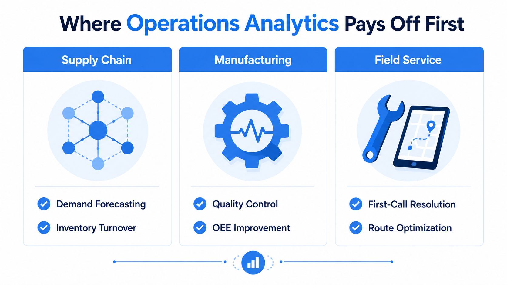
The fastest wins come where the loop between signal and intervention is short. That's why three domains keep showing up first, supply chain and fulfillment, customer support and customer ops, and incident or IT operations. They all have live queues, visible bottlenecks, and people who can act the same day.
Supply chain and fulfillment
Supply chain teams watch inventory, pick-pack-ship flow, exception queues, and delivery performance. Their rhythm is hourly or shift-based, and the best managers are looking for movement, not narrative. If on-time delivery softens or an exception queue starts to swell, they reroute work, adjust labor, or flag a supplier issue before the delay spreads.
Operational analytics feels obvious because the work itself is time-sensitive. Data freshness matters, because a stale exception queue is just a story about yesterday's problem. The same playbook works whether the issue is inventory imbalance, dock congestion, or a blocked fulfillment step.
Customer support and customer ops
Support leaders care about ticket aging, first-response time, deflection, resolution path, and the customer's experience across those steps. Their operations rhythm is different from supply chain, but the logic is the same, monitor the live queue, intervene where wait time is compounding, and route work to the right owner quickly. The best teams don't just know that the queue is long, they know which path through the queue creates the most friction.
This is also where self-serve access matters. A team lead shouldn't need to wait for a central analyst to answer whether a channel shift, product issue, or staffing gap is causing the spike. Non-analysts need views they can trust and act on without opening a ticket.
Incident and IT operations
Incident response is the purest operational use case. Teams monitor detection time, resolution time, alert noise, and change stability, then make fast decisions about severity, escalation, and containment. The operational rhythm is immediate, and the cost of hesitation is obvious.
The architecture lesson from find competitive edge with sync becomes relevant, because fast-changing signals only help if they arrive in sync with the work. If a service desk or SRE team sees the issue late, the alert has already lost value.
Operational test: if your team only needs the data to decide whether to meet tomorrow, it belongs in BI. If it needs the data to act today, it belongs here.
Operations analytics does not belong first in quarterly planning, long-horizon forecasting, or board reporting. Those are still better served by traditional BI and planning tools. Use the right system for the time horizon.
Data and Architecture for Real-Time Operations
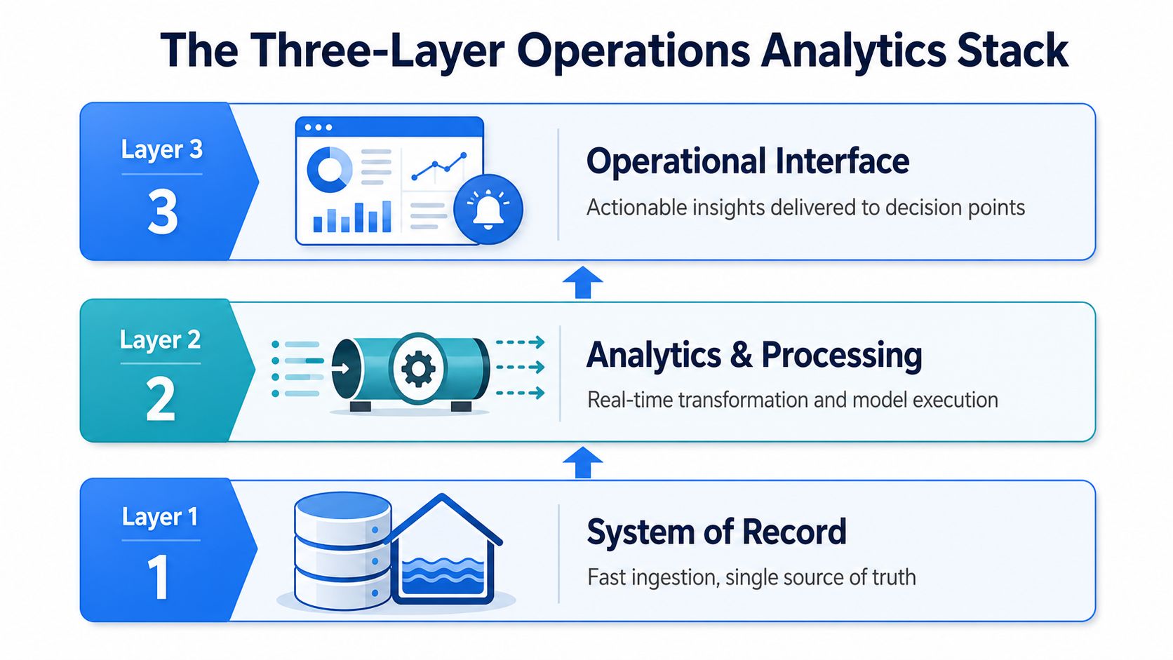
A real-time operation needs three layers that work together, and they need to be designed in order. The first is the system of record, the warehouse or lakehouse that ingests fresh operational data fast enough to stay useful. The second is the modeling layer, where metric definitions are standardized so everyone is looking at the same backlog, the same on-time measure, and the same service-level logic. The third is the consumption layer, where non-analysts query, monitor, and act without opening a ticket to the data team. For a warehouse-centric view of this stack, data warehouse architectures is a useful reference.
The warehouse is the product surface
This is the architecture decision that matters most for a self-serve-first team. Treat the warehouse as the product surface, not the BI tool. The BI layer can present data, but the warehouse is where freshness, definitions, and access policy have to hold up under operational use.
That's also why the implementation sequence from enterprise guidance matters. Define business and operational goals first, choose the KPIs that support them, verify source-data accuracy and availability, then deploy and test before rolling out broadly (Striim operational analytics guide). If you skip the modeling layer, conflicting definitions will leak into every dashboard. If you skip the consumption layer, the data team becomes the bottleneck again.
What each layer must deliver
Layer 1, System of Record. It needs fast ingestion and a single source of truth. Operational tables must stay fresh enough to support decisions in minutes, not overnight.
Layer 2, Analytics and Processing. It needs real-time transformation, standardized business logic, and model execution if you're using anomaly detection or rules. This layer is where the same metric gets defined once, not recreated in five places.
Layer 3, Operational Interface. It needs dashboards, alerts, and query access that decision-makers can use. The goal is not pretty charts, it's action at the point of work.
A useful practical example of unified operational data management is AWS CloudWatch's newer approach to log normalization and Iceberg-compatible access, which shows how operations data can be correlated across systems without forcing every team through a separate copy of the truth (AWS CloudWatch unified data management).
A Rollout Plan That Does Not Wait on Headcount
Start with the workflow, then the tooling follows. Pick two or three operational decisions that are slow, inconsistent, or stuck in email threads, then define the metric that proves the decision got better. If you cannot name the decision and the owner, you are not ready to build the dashboard.
People first, then access
Name the owner of each operational metric. That person owns the number and the action that follows it, while the analyst or data team owns the model and the view. Then decide which non-analysts need direct access to the warehouse or a governed consumption surface, because every request that has to pass through the data team adds delay and turns the team into a queue.
Self-serve only works when the guardrails are clear. If your rollout depends on the data team answering every question, the rollout has already failed.
Smallest viable stack wins
Use the smallest stack that meets freshness and self-serve requirements. For a startup, that usually means one warehouse, one modeling layer, and one consumption surface, with a narrow pilot that ships in about 60 days. For a mid-market company, the shape stays the same, but governance gets tighter, the semantic layer gets more formal, and the rollout window stretches to about 120 days.
Querio is one example of a warehouse-facing analytics workspace that lets users query live warehouse data in plain English and build reports without routing every request through a central analyst queue. It fits this pattern because the product surface sits on top of the warehouse rather than replacing it, which is the architecture choice that matters most here. If you want the rollout to stick without adding headcount, building a data culture without hiring a data team means giving operators a governed way to answer routine questions themselves.
The operational rollout should feel boring, not heroic. Hopted's report catalog is a good reminder that teams usually need a narrow set of dependable operational views, not a giant catalog of possibilities. Build the few views people will use, then expand only after the first loop works.
A practical rollout also needs a test-and-learn cadence. Start with one team, one queue, and one set of decisions. Prove the cycle once, then scale the pattern instead of scaling the noise. The wrong tool in the right sequence still beats the perfect tool dropped into the wrong workflow.
Governance, Measurement, and the Pitfalls That Sink Rollouts
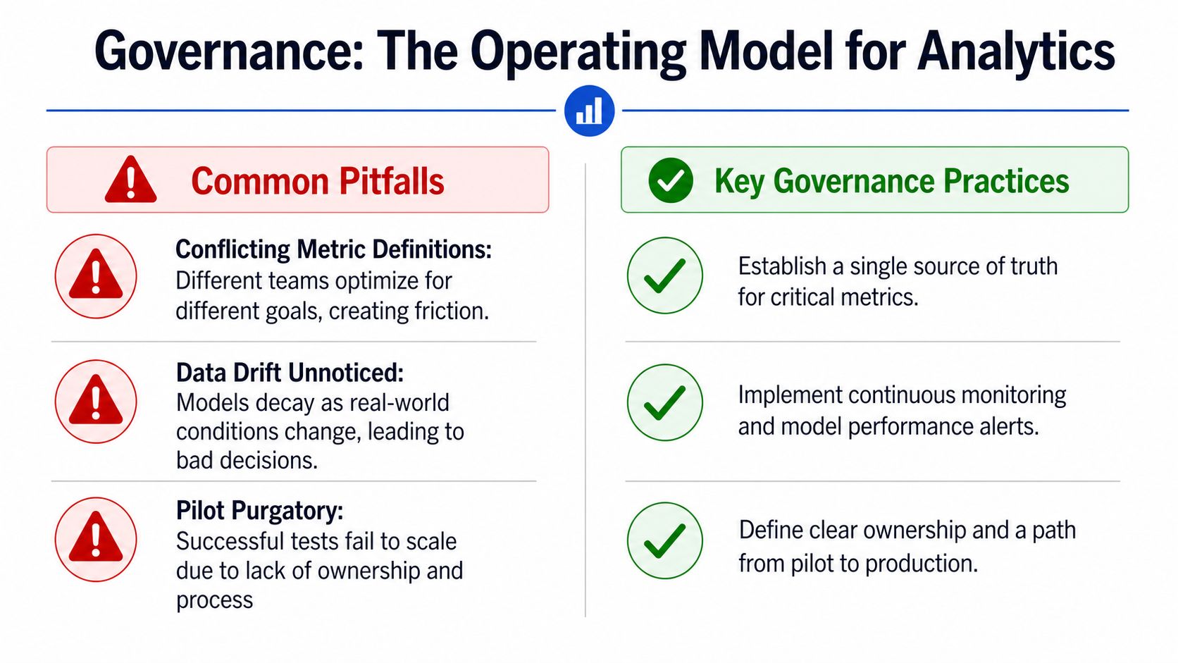
Governance is not a compliance layer on top of analytics. It's the operating model that keeps the numbers trusted enough to act on. When governance is weak, the dashboard becomes a debate club.
Conflicting metric definitions kill trust
The symptom is familiar, support, finance, and product each publish a different version of “on-time delivery,” and nobody trusts the number. The root cause is metric logic spread across teams without a single owner or shared definition. The fix is to name one owner, define the metric once, and force every downstream view to inherit that logic.
Alert fatigue turns signals into noise
The symptom is that every threshold fires, then operators mute the channel. The root cause is alerting designed around possible problems instead of actionable ones. The fix is to tune alerts to decisions, not to fear, and retire any alert that doesn't trigger a clear action.
Dashboards with no owner die quietly
The symptom is a red tile nobody owns, which means no one is responsible when it stays red. The root cause is a view that was launched without accountability. The fix is simple, assign a named owner, define the response, and delete views that no longer drive action.
McKinsey's process-insights perspective is useful here because it argues that the most valuable operational analytics work is hypothesis-driven, embedded in automation or continuous improvement, and used to augment subject-matter expertise rather than replace it (McKinsey on process insights). That's the governance standard to aim for.
The measurement question is blunt. Did the analytics change an outcome this week, or did it only describe one? If nobody can answer that, the rollout isn't finished.
Putting Operations Analytics to Work This Quarter
The fastest way to prioritize is to ask four questions and force a concrete answer to each one. Which two operational decisions, if improved this quarter, would move the business most. Which existing metric has no owner. Where does data freshness currently block action. Which non-analyst would benefit from direct warehouse access.
Each question should map to one move
If a decision matters most, build only the view that supports that decision first. If a metric has no owner, assign one before you add another dashboard. If freshness is the blocker, fix the pipeline and the model definition before you buy another visualization layer. If a non-analyst needs access, give them a governed way to query the warehouse instead of making them wait on the data team.
That's the operating principle worth keeping. Analytics for operations is a workflow problem wearing a data costume, and teams that treat it that way get compounding value. Teams that treat it like a reporting project end up with more screenshots and the same delays.
If your team is trying to make operational metrics usable without turning the data group into a ticket desk, Querio is built for that model. It sits on the warehouse, supports self-serve querying and reporting, and gives operational teams a way to work from governed live data instead of waiting in line. Visit Querio and see whether your current stack is helping the operation move, or just helping people describe why it didn't.