Customer Success Metrics That Actually Predict Retention
Master the customer success metrics that drive revenue retention. Learn formulas, benchmarks, and how to build dashboards that predict churn before it happens.
https://www.youtube.com/watch?v=PywKoCTUObU
published
Outrank AI
customer success metrics, NRR benchmark, churn prediction, SaaS retention, customer health score
c9ec5699-cfe6-400c-8dc4-06ec7c7a76ce

Most advice about customer success metrics starts with the wrong question: “Which numbers should we add to the dashboard?” The better question is, which observable customer outcomes change before renewal, contraction, or expansion?
NPS, login frequency, ticket volume, and health scores are easy to collect. That doesn't make them reliable measures of value. A customer can log in regularly while failing to achieve the business result that justified the purchase. Another can submit few tickets because the product is underused, not because the experience is healthy.
The practical shift is from measuring customer activity to proving value realization. Revenue metrics show whether value is durable, feedback metrics reveal friction, and behavioral data shows whether customers are moving toward the outcomes they intended to buy. The strongest dashboards connect all three instead of allowing one convenient score to stand in for customer success.
Table of Contents
Why Most Customer Success Dashboards Fail
A dashboard can be accurate and still be strategically misleading. It may report every login, survey response, and support interaction correctly while failing to answer the executive question that matters: will this customer continue to receive enough value to renew and expand?
NPS is often treated as a summary of account health, but it measures willingness to recommend, not whether a customer achieved a defined business outcome. Login frequency has a similar weakness. Usage can indicate opportunity, but raw activity doesn't distinguish productive adoption from habitual checking, administrative access, or usage by people who never own the buying decision.
Support tickets create another trap. A rising ticket count can indicate friction, but a low count can mean either a smooth experience or a customer that has stopped trying. Without context, the metric is ambiguous.
The dashboard test: If a metric changes, can a customer success manager identify the account action that should follow?
The problem isn't that these signals are useless. The problem is that teams often promote them from inputs to outcomes. That creates false confidence. A green health score can conceal weak adoption of a critical feature, unresolved commercial concerns, or an executive sponsor who no longer believes the product is strategically important.
A better measurement system begins with the customer's intended result. For a reporting product, that might be faster access to trusted answers. For a workflow platform, it might be successful completion of a process without manual intervention. The metric should capture evidence that the result occurred, then connect that evidence to renewal and expansion behavior.
Data architecture also matters. Disconnected definitions produce dashboards that look polished but disagree about account status, renewal dates, or active usage. Teams building reporting foundations can use this guide to avoiding common BI dashboard pitfalls to audit definitions, ownership, and dashboard logic before adding more KPIs.
The industry shift toward outcome-based measurement follows a broader operating change. A 2026 state-of-customer-success report found that 80% of customer success professionals say the function drives revenue, while over half reported fragmented data and two-thirds said they have no enablement support. Those findings point to a measurement problem as much as a staffing problem. Teams are being asked to influence revenue while working from incomplete evidence.
Revenue Metrics That Define Customer Success
Executives don't evaluate customer success through activity alone. They look at whether the existing customer base retains and grows recurring revenue. That makes cohort-level revenue metrics the anchor for a serious measurement system.
Net revenue retention as the operating metric
Net Revenue Retention, or NRR, captures renewals, expansions, contractions, and churn within an existing cohort:
NRR = (Starting recurring revenue + expansion - contraction - churn) ÷ starting recurring revenue × 100
A company can grow a customer cohort without adding new logos when expansion offsets losses. Industry guidance describes above 100% NRR as best-in-class territory and says companies should ideally exceed 110%, according to Gainsight's customer success metrics guidance. SaaS benchmarks cited by Appcues describe 110%+ as strong and 120%+ as best-in-class.
NRR is diagnostic because it forces teams to separate four different motions. Churn points to lost accounts or revenue, contraction identifies downgrades, expansion measures successful growth inside the base, and renewals preserve the starting position. A single renewal percentage hides these distinctions.
Gross retention and expansion
Gross Revenue Retention, or GRR, removes expansion from the picture:
GRR = (Starting recurring revenue - churn - contraction) ÷ starting recurring revenue × 100
GRR answers a narrower question: how much of the original recurring revenue did the business keep before upsells and cross-sells? Compare it with NRR. A healthy NRR paired with weak GRR may mean expansion is masking meaningful customer losses.
Expansion MRR measures recurring revenue from upsells, cross-sells, increased seats, or higher usage tiers. It should be segmented by customer cohort, product, use case, and trigger. Otherwise, a large expansion deal can obscure the fact that most accounts never reach the adoption milestone associated with growth.
Customer Lifetime Value, or LTV, connects customer economics to retention performance. A simple subscription formula is:
LTV = average revenue per user × average length of the customer relationship
That formula is useful for directional planning, but it becomes unreliable when teams blend customer segments with very different pricing, retention patterns, or expansion paths. Calculate it by cohort and acquisition motion whenever the data allows.
The executive comparison
Metric | Formula | Strong benchmark | What it reveals |
|---|---|---|---|
NRR | (Starting recurring revenue + expansion - contraction - churn) ÷ starting recurring revenue × 100 | Above 110% is an ideal benchmark in industry guidance, while 110%+ is strong and 120%+ is best-in-class in SaaS benchmarks | Whether the existing revenue base is expanding or leaking value |
GRR | (Starting recurring revenue - churn - contraction) ÷ starting recurring revenue × 100 | No universal benchmark is provided here | Pure retention performance before expansion |
Expansion MRR | Recurring revenue from upsells, cross-sells, and account growth | No universal benchmark is provided here | Whether customers find enough value to buy more |
LTV | Average revenue per user × average relationship length | No universal benchmark is provided here | The long-term economics of retained customers |
The important design choice is cohort discipline. Report these metrics by start month, plan, segment, use case, and customer size rather than relying on a portfolio average. Averages tell leadership what happened overall. Cohorts show which onboarding paths, product experiences, and customer profiles create durable revenue.
Customer Feedback Metrics and Their Predictive Power
Feedback metrics measure perception, not revenue. That doesn't make them secondary. It means they need to be interpreted as signals inside a larger retention model.
NPS measures loyalty at a distance
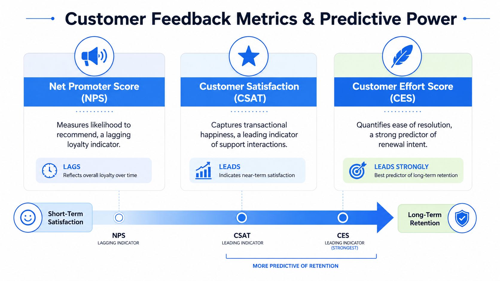
NPS asks whether customers would recommend the company or product. It can help identify broad sentiment and generate qualitative follow-up, but it usually sits farther from the operational event that caused the customer reaction. A strong score doesn't prove that the customer reached a commercial outcome, and a weak score doesn't explain whether the issue is product capability, support friction, pricing, or unmet expectations.
That distance makes NPS dangerous as a standalone renewal KPI. Teams may optimize survey participation or score movement without changing the customer journey that determines value.
CSAT captures a specific interaction
CSAT is more local. It measures satisfaction with an interaction, such as support, onboarding, or a product experience. Its proximity to the event makes it useful for diagnosing service quality, but it still doesn't establish that the customer achieved the intended business result.
A peer-reviewed comparison of satisfaction, NPS, and CES found that top-2-box customer satisfaction predicted retention better than the other measures across industries, with extreme positive responses more useful than the full response scale, according to the study indexed by RePEc. That finding supports a more precise use of CSAT. Track highly satisfied cohorts and examine whether they later renew or expand.
CES exposes friction
Customer Effort Score, or CES, asks how easy it was for a customer to complete an interaction or resolve a problem. It can expose process and product friction that a polite satisfaction response misses. A customer may be satisfied with a support agent while still having to work too hard to obtain a result.
Use feedback scores as weighted leading indicators:
NPS: Monitor relationship sentiment and investigate meaningful changes.
CSAT: Connect extreme positive and negative responses to the interaction that produced them.
CES: Isolate difficult workflows, support journeys, and setup steps.
Open text: Code recurring themes and connect them to usage, outcomes, and renewal behavior.
The practical conclusion is contrarian but useful: don't ask which survey metric “wins.” Ask which score predicts a specific customer behavior in your business, then test that relationship against actual renewal, contraction, and expansion records. TSIA's 2025 customer success research describes a move away from NPS toward more predictive, outcome-driven measures, including adoption and broader voice-of-customer signals.
Building a Predictive Customer Health Score
A health score should compress evidence without erasing the reasons behind it. Red, yellow, and green labels are only useful when the underlying signals lead to different interventions.
Start with the outcome, not the available data
Write down the intended customer outcome before selecting fields. “Uses the product frequently” is an activity definition. “Completes the workflow that removes the manual process” is closer to value realization.
Then map evidence to that outcome:
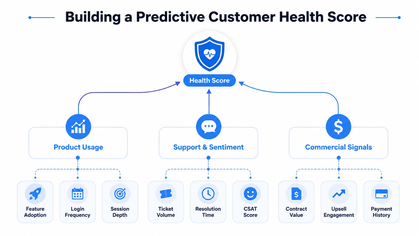
Product behavior: Track adoption of the features required for the outcome, active users by role, and meaningful workflow completion.
Commercial status: Include renewal timing, expansion conversations, contraction, payment history, and contract structure.
Support and sentiment: Add unresolved friction, resolution patterns, CSAT, CES, and relevant qualitative themes.
Outcome achievement: Record whether the customer has reached the agreed milestone, not merely whether a CSM completed an activity.
A customer health model that includes only usage will miss commercial risk. One that includes only survey scores will miss behavioral disengagement. One that includes only support data will overrepresent customers who contact the help desk.
Weight signals by observed behavior
Don't assign weights because a vendor's template recommends them. Start with historical account records and compare signals before churn, renewal, contraction, and expansion. If outcome achievement consistently separates retained cohorts from lost cohorts, it deserves more influence than a generic login count.
Validate the model by checking whether high-risk accounts show more adverse outcomes than low-risk accounts. Review false positives, where the score predicts risk that doesn't materialize, and false negatives, where an account appears healthy until it churns. Each error should lead to a model adjustment or a data-quality investigation.
Practical rule: A health score earns trust only when its components explain the recommended action.
Build the data spine
Connect product analytics, billing, CRM, support, and survey systems around a stable account and user model. Define the grain of every metric. “Active account” might mean an account with any login, a customer with a completed workflow, or a paying account with an engaged primary user. Those definitions aren't interchangeable.
Behavior tracking is most useful when teams connect events to outcomes and account context. A user behavior tracking guide can help organize the event layer before health-score logic is built on top of it. Keep the score inspectable. CSMs should be able to see which component changed, when it changed, and what evidence supports the recommendation.
Choosing Metrics by Company Stage and Role
The right metric set depends on the question the company can answer today. Early teams often need a small measurement loop that confirms customers reach value. Mature organizations can support more segmentation, predictive modeling, and commercial attribution, but complexity only helps when the underlying definitions are stable.
Early-stage companies
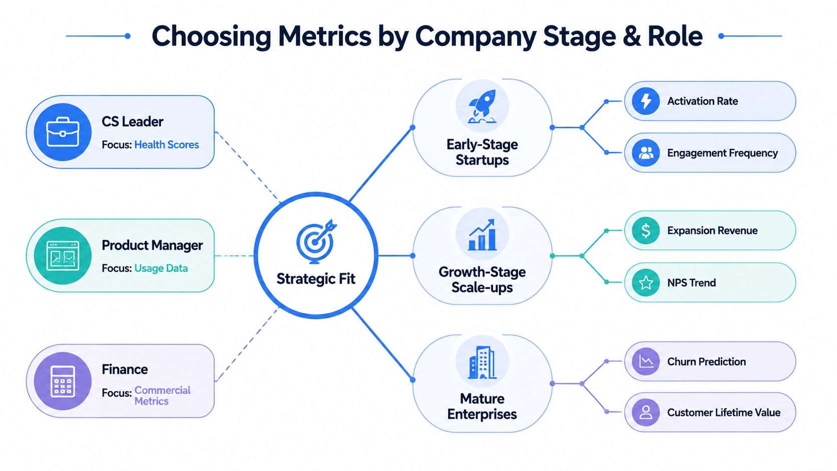
Founders and early customer success leaders should prioritize the path from activation to intended outcome. Track whether new customers complete the critical workflow, how long they take to reach first value, and where implementation stalls. Engagement frequency can help diagnose adoption, but it shouldn't replace outcome evidence.
The measurement system should stay close to customer conversations. A CSM can pair a usage change with a documented reason, such as an integration failure, unclear ownership, or a missing capability. This qualitative context is more valuable than an elaborate score that nobody trusts.
Growth-stage scale-ups
Scale-ups need to connect customer experience to expansion. NRR, GRR, expansion MRR, contraction, renewal likelihood, and outcome attainment belong in the executive layer. Product leaders should break usage down by feature and persona, while CS leaders need account-level health signals that trigger repeatable plays.
This is also the stage where cohort analysis becomes indispensable. Segment by acquisition source, plan, implementation path, customer size, and use case. A broad average can hide a successful segment subsidizing a failing one.
Mature enterprises
Enterprise teams usually need stronger governance. Finance wants reconciled revenue definitions. Product wants adoption by workflow. Customer success wants risk and opportunity prioritization. Data leaders need shared dimensions, lineage, access controls, and a reliable history of metric changes.
Assign ownership explicitly:
CS leaders: Health score components, renewal risk, outcome milestones, and intervention results.
Product managers: Activation, feature adoption, workflow completion, and time to value.
Finance: NRR, GRR, contraction, expansion MRR, and account economics.
Data leaders: Metric definitions, source reliability, cohort logic, and access.
The mistake is copying an enterprise dashboard before the company has a repeatable customer journey. Add complexity when a decision requires it, not because the organization has accumulated more data. The KPI measurement guide provides a useful discipline for connecting each metric to an owner, definition, and business decision.
Implementing Self-Serve Analytics for Customer Success
A customer success dashboard becomes useful when it supports investigation, not just monitoring. CSMs need to answer questions such as which feature a declining account stopped using, whether similar customers reached value, and whether expansion-ready accounts share a recognizable pattern.
Establish a warehouse model
Bring product events, billing records, CRM objects, support conversations, and survey responses into a warehouse. Standardize account identity first. If the product system calls an organization one thing, the CRM uses another identifier, and billing groups subsidiaries differently, the dashboard will produce contradictions no visual design can fix.
Create shared tables or semantic models for:
Accounts: Segment, plan, owner, lifecycle stage, and contract dates.
Revenue movements: Starting revenue, churn, contraction, expansion, and renewal status.
Product behavior: Users, features, workflows, and event timestamps.
Customer experience: Tickets, resolution status, survey responses, and qualitative themes.
Outcomes: Agreed goals, milestones, evidence, and achievement dates.
Document the grain and refresh behavior of each dataset. A daily product event table shouldn't be joined casually to a monthly revenue snapshot without defining how the time windows align.
Move beyond static dashboards
Static dashboards answer predefined questions. Self-serve analytics lets teams investigate exceptions. A CSM might filter accounts where renewal is approaching, outcome achievement is incomplete, and critical feature adoption has declined. A product manager might compare workflow completion across cohorts created by onboarding path.
Natural-language querying can lower the barrier for non-technical users, but it needs governed definitions and reviewable logic. Otherwise, users receive fast answers to ambiguous questions. Custom Python notebooks add flexibility for analysts who need cohort analysis, feature comparisons, or model validation without waiting for a new dashboard tile.
Querio is one option for this operating model. It deploys AI coding agents directly on the data warehouse and uses a file-system approach with custom Python notebooks, allowing technical and non-technical users to query and build on company data within a shared analytics environment.
Put investigation next to action
Every dashboard element should lead to a next step. A declining outcome score might create an executive alignment task. A high-adoption account with an unaddressed expansion signal might create an account review. A support-friction cluster might route to product operations.
Teams should also record whether the intervention worked. Without intervention outcomes, the organization can measure risk detection but not the effectiveness of its response. That closes the loop between analytics, customer work, and retention.
The broader design principle resembles a complete guide to self-service business intelligence: centralize trustworthy infrastructure while giving business users room to explore. Data teams shouldn't become a human API for every account question. They should maintain the definitions, models, and controls that let customer-facing teams investigate safely.
Common Measurement Mistakes and How to Avoid Them
Most measurement failures come from category errors. Teams use a retention metric to explain adoption, a survey score to prove value, or an activity count to predict a commercial event. The dashboard then appears complete because it contains many numbers, while the decision logic remains weak.

Treating retention as binary
Renewed versus churned is too coarse for subscription economics. It hides contraction, expansion, partial product adoption, and accounts that renew only after reducing scope. Use GRR to isolate retained revenue, NRR to include expansion, and separate movement categories to show how the cohort changed.
Measuring activity instead of achievement
Training completed, meetings held, and logins recorded are process indicators. They can support a success plan, but they don't prove that the customer achieved the result they purchased.
Replace activity-only reporting with milestone evidence:
Activation: Did the customer complete the critical first workflow?
Adoption: Are the intended roles using the necessary capabilities?
Value: Did the customer reach the agreed operational or commercial result?
Durability: Did the behavior and outcome persist through the renewal journey?
Averaging away the problem
A portfolio average can conceal a failing segment, a weak onboarding route, or a product feature that only works for a narrow customer profile. Compare cohorts by acquisition path, plan, use case, lifecycle stage, and customer size. The objective isn't to create endless slices. It's to find the dimensions that explain different retention and expansion behavior.
Optimizing survey scores
A score can improve while the business outcome stays flat. Survey response bias, timing, and question wording all affect interpretation. The peer-reviewed evidence cited earlier supports prioritizing extreme positive satisfaction responses, but even those should be linked to behavioral and revenue records before teams treat them as predictive.
Audit the dashboard by asking three questions: What decision does this metric support? What customer behavior should it precede? Can we verify that relationship in our own cohorts? Remove metrics that fail all three tests, or demote them to diagnostic context rather than executive KPIs.
Customer success teams need more than another static dashboard. Querio provides a warehouse-connected environment where teams can query account behavior, combine product and revenue data, and use custom Python notebooks to investigate value realization and retention signals. Visit Querio to see how your data team can support self-serve customer success analytics without becoming a bottleneck.