7 Smart Dashboard Alternatives for Data Leaders
Tired of static reports? Explore 7 smart dashboard alternatives, from AI notebooks to embedded analytics, designed for modern product and data leaders.
published
Outrank AI
dashboard alternatives, self-serve analytics, data apps, embedded analytics, business intelligence
8c8c238c-c91b-463a-8ce3-67e24c6f96e5

The dashboard paradox is real. Teams keep building more charts, yet leaders still ask for the same answers in Slack, meetings, and follow-up tickets. That's why the most useful dashboard alternatives aren't just prettier interfaces, they're different ways of deciding what data work should do, who should do it, and when a static view should be replaced by something more interactive. For a useful framing on analytics on the web, the DesignStack analytics guide is a solid companion read.
Table of Contents
1. Self-Serve Analytics Notebooks
Dashboards are good at summarizing known questions. They're weak when the business question changes midstream, which is exactly when analysts end up screen-sharing and rebuilding filters live. Analytics notebooks solve that problem by putting code, narrative, and outputs in one place, so the logic behind the answer stays visible instead of buried in a BI click path.
Why notebooks replace the dashboard habit
A notebook is the right move when your team needs to explore messy data, test assumptions, or document how a metric was derived. Tools like Jupyter and Hex work well here because they let analysts mix SQL, Python, R, charts, and commentary in one artifact. That makes the work easier to review later, and it usually reduces the “can you show me how you got that?” loop that follows polished dashboards.
The trade-off is discipline. Notebooks can sprawl if every analyst creates their own version of the truth, and non-technical stakeholders won't love starting in a code-first environment. They're also a poor substitute for live operational monitoring, because a notebook is usually meant to explain a question, not sit on a wall all day.
Practical rule: use notebooks for investigation and explanation, not for stable KPI surveillance.
The strongest notebook teams pair this approach with clear publishing norms. That's where the internal interactive notebook templates resource fits into a real workflow, especially if you need reusable structures for recurring analyses. In practice, the best notebooks act like living analysis memos, not personal scratchpads.
2. The Centralized Metrics Layer
Most dashboard pain starts with inconsistent definitions. One team counts an active user one way, another team counts it another way, and suddenly the executive meeting becomes a debate about math instead of a discussion about the business. A metrics layer, sometimes called a semantic layer, is the cleaner answer because it separates business logic from the presentation layer.
The real job of the metrics layer
This approach matters most when multiple tools need to agree. A BI dashboard, a spreadsheet, and a notebook can all pull from the same definition of MRR, retention, or conversion if the logic lives in one governed layer. That doesn't just improve consistency, it also makes self-service safer because users aren't re-implementing formulas every time they ask a question.
The downside is that a metrics layer isn't a quick fix. It takes cross-functional agreement, engineering effort, and ongoing ownership. If the definitions aren't aligned with finance, product, and data teams, the layer becomes another place where arguments get stored instead of resolved.
A practical way to think about it is this, the metrics layer is not the dashboard replacement itself, it's the trust mechanism behind every replacement. If you skip it, you can still move faster for a while, but the organization eventually pays for that speed in rework and confusion. For teams evaluating the concept in more detail, the internal semantic layer explainer is a useful reference point.
What good looks like
Single metric logic: every surface pulls from the same business definition.
Decoupled tooling: you can change front-end tools without rewriting core logic.
Governed self-service: users move faster because the guardrails are already there.
3. Contextual Embedded Analytics
Separate analytics portals create a lot of friction. Users leave the workflow, open another tool, find the right report, and then return to the system where the actual work happens. Embedded analytics reduces that friction by putting the insight inside the product, CRM record, warehouse workflow, or internal tool where someone is already making decisions.
The biggest reason this approach works is context. A customer health chart inside an account view is more useful than the same chart in a generic BI portal because the user already knows which account they're trying to save or expand. The insight lands at the moment of action, which is why embedded analytics often beats a standalone dashboard for operational teams and customer-facing products.
The trade-off is implementation complexity. Embedded experiences need permissions, performance tuning, and careful product design so they don't feel bolted on. Licensing can also matter more than teams expect, especially if the embed is part of a revenue product.
Where embedded analytics earns its keep
When the business question belongs inside a workflow, embedded analytics usually wins. Product teams use it for usage views, sales teams use it for account intelligence, and operations teams use it for inventory or support contexts. The best versions feel native, not pasted in.
There's also a strategy angle here. If your organization wants to monetize analytics or increase adoption inside an application, embeds can turn data from a reporting layer into a product feature. The internal embedded analytics guide is relevant if your team is deciding whether the embed should be customer-facing, internal, or both.
Embedded analytics works best when the answer is only useful if it's attached to the action.
4. Interactive Data Apps
Dashboards show state. Data apps let people change state. That difference matters when the user doesn't just need visibility, they need a guided workflow that ends in an action, like launching a retention list, approving a pricing change, or triaging a customer segment.
A good data app is usually built around one business job, not a generic reporting need. That's why this pattern works for specific operations, and often fails when teams try to make it do everything a BI tool used to do. If you need broad exploration, a data app is too opinionated. If you need a repeatable action path, it's often the better choice.

When a dashboard isn't enough
Interactive apps shine when decisions need write-back, approvals, or triggers. A churn-risk list is a dashboard. A churn-risk list that lets a user launch a campaign is a data app. That extra step is what removes the gap between insight and execution.
The cost is maintenance. Custom apps accumulate edge cases quickly, and they usually need data, engineering, and UX skills to stay usable. They're not the right answer for teams that mainly need a clean readout of standard KPIs.
Use this pattern when the metric is tied to a process, not just a meeting. If nobody acts on the output, a data app may be overbuilt. If the business process depends on fast response, the app can replace a dashboard and the manual handoff that follows it.
5. Proactive and Anomaly-Based Alerting
Many dashboards fail for a simple reason, people don't open them at the exact moment something breaks. Proactive alerting flips the model by pushing an exception to the user instead of asking the user to go hunting for it. That makes the system more operational and less passive.
This is especially useful for product health, revenue drops, infrastructure issues, and support spikes. If a key metric crosses a threshold or behaves strangely, the right people should know in Slack or email without needing to refresh a chart. In practice, this reduces attention drift, because the team only gets interrupted when the data matters.
The obvious risk is alert fatigue. Poor thresholds create noise, and noisy alerts get ignored. A weaker risk is false confidence, because alerting helps you notice problems faster, but it doesn't help you investigate root cause or explore “what if” scenarios.
What makes alerting a real alternative
The best alerting systems are narrow, not broad. They focus on a few business-critical conditions, use sensible thresholds, and route notifications to the people who can act. That's very different from dumping every metric into a dashboard and hoping someone checks it in time.
For teams comparing alternatives, the key question is whether the data problem is observational or operational. If the answer requires constant human monitoring, alerting often beats dashboards. If the answer requires analysis, alerting should be the trigger, not the destination.
Alerting is strongest when the business wants exceptions, not status reports.
6. The AI-Powered File System for Data
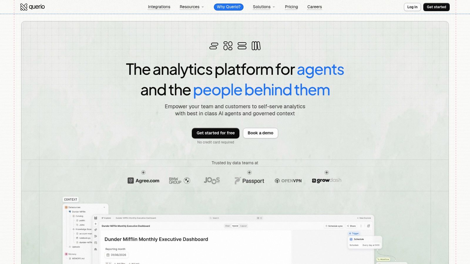
The most interesting shift in dashboard alternatives isn't visual, it's architectural. Many teams don't want another dashboard layer. They want a way to ask questions, inspect logic, publish trusted outputs, and keep the whole analytical trail visible. That's the promise behind Querio's AI-powered file system for data, and it's why this category deserves more attention than the typical BI comparison gets.
Querio places AI coding agents directly on the warehouse, which means the work stays close to the source of truth instead of getting trapped in a black-box reporting layer. Its file-system approach uses versioned Python notebooks and reactive cells, so answers aren't just generated, they're inspectable, editable, and reusable. That matters when data leaders are tired of becoming a human API for every ad hoc question.
Why this approach changes the operating model
The practical advantage is transparency. A non-technical user can ask a question, but the output is still backed by SQL or Python that a data team can review. That's a different stance from most AI analytics tools, where the user gets an answer first and the audit trail second. For organizations that care about governance, that difference is the whole game.
It also helps when leaders want self-service without letting the metric layer dissolve. Querio's context layer is designed to capture company logic and keep it versioned, while publishable Boards give teams a way to share approved outputs instead of one-off screenshots. The result is a system that behaves less like a dashboard factory and more like a maintained analytical workspace.
The biggest trade-off is that code-first workflows still assume some analyst or developer capacity. AI reduces friction, but it doesn't remove the need for people who can shape logic, validate outputs, and keep the system coherent. Even so, this is the kind of platform that can replace multiple point solutions when a team is trying to move from static reporting to reusable analysis and governed self-service.
Where Querio fits in practice
Querio also matters because it connects the conversation between dashboards and action. It can support internal analytics, customer-facing experiences, and warehouse-native exploration without forcing every user through the same rigid UI. For teams comparing Hex, Looker, or ThoughtSpot-style workflows, the attraction is less about another charting surface and more about a system that preserves logic while reducing analyst bottlenecks.
7. AI-Powered Conversational Analytics
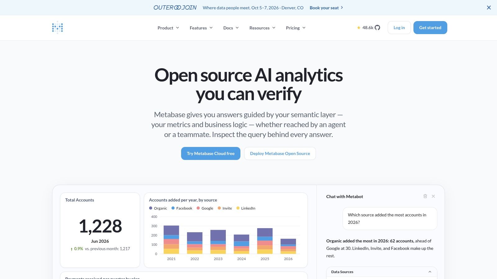
Conversational analytics is the most visible sign that dashboard behavior is changing. Instead of hunting through filters, users ask a question in plain English and get an answer, often as a number or chart. That's appealing because it turns data access into a conversation instead of a navigation exercise.
Why people reach for conversational tools
The main advantage is speed. Business users don't need to know where a report lives or which filter to click first. They can ask the question directly, which is why conversational analytics has become attractive for teams trying to reduce the backlog of routine requests.
But the tool only works as well as the data model behind it. If metric definitions are messy, the AI can misread intent or return something that looks plausible but isn't reliable. That's why this category pairs best with governance, not instead of it.
The internal conversational analytics definition and use cases resource is worth a look if your team is deciding whether conversational access should sit on top of dashboards, notebooks, or a warehouse-native workflow. In the best implementations, conversational analytics doesn't replace all analysis. It handles the first question quickly, then hands off to deeper tools when the work gets serious.
Use conversational analytics for speed, then verify with a governed layer before the result reaches a decision-maker.
7-Way Comparison of Dashboard Alternatives
Solution | Implementation Complexity | Resource Requirements | Expected Outcomes | Ideal Use Cases | Key Advantages |
|---|---|---|---|---|---|
Self-Serve Analytics Notebooks | Medium–High, code-heavy, learning curve for non-technical users | Skilled analysts/data scientists, compute resources, versioning | Flexible, reproducible deep-dive analyses and transparent workflows | Data science/analytics teams doing root-cause, modeling, ad-hoc exploration | Maximum flexibility; full reproducibility; strong collaboration |
The Centralized Metrics Layer | High, design, modelling and cross-team alignment required | Data engineering, governance processes, maintenance overhead | Consistent, trusted company-wide metrics and fewer reporting discrepancies | Scaling organizations with inconsistent reports and trust issues | Single source of truth; decouples logic from tools; accelerates self-service |
Contextual Embedded Analytics | High, integration, security, and UX work required | Frontend engineering, embedding infra, performance and licensing considerations | Higher adoption and faster action by surfacing insights in workflow | Product leaders adding in-app analytics; operational workflows | In-context insights; increases product stickiness; shortens action path |
Interactive Data Apps | Medium–High, combines app development with data workflows | Developers, data engineers, UX designers, ongoing maintenance | Action-oriented tools that enable write-back and close the analysis→action loop | Operational teams (sales, marketing, logistics) needing repeatable actions | Tailored UX for workflows; enables immediate actions; highly focused |
Proactive & Anomaly-Based Alerting | Medium, detection logic + delivery channels and tuning | Monitoring infra, anomaly models, alert routing and tuning | Faster response to critical events and reduced manual monitoring | DevOps, growth, and ops teams monitoring real-time system/funnel health | Timely, focused notifications; reduces cognitive load; improves SLAs |
The AI-Powered "File System" for Data (Querio) | Medium–High, notebook-first + AI agents; code-forward but aided by AI | Warehouse connectivity, analysts/engineers, platform subscription and governance | Transparent AI-backed answers, faster exploration, governed reusable logic | Product/data leaders needing embeddable, code-transparent self-serve analytics | Notebook-first transparency; AI agents; versioned governance; embeddability |
AI-Powered Conversational Analytics | Medium, NLP/LLM integration plus governance required | LLM/NLP stack, clean governed data model, integration and tuning | Instant plain-English answers and democratized data access | Organizations with strong governance wanting wide user access | Low barrier to entry; instant ad-hoc answers; reduces routine analyst load |
Choosing Your Post-Dashboard Strategy
Moving beyond the dashboard doesn't mean deleting every BI tool your team already has. It means matching the interface to the job. If the problem is inconsistent business logic, start with a centralized metrics layer. If the problem is deep investigation, use analytics notebooks. If the problem is action latency, look hard at embedded analytics, data apps, or proactive alerting.
The biggest mistake leaders make is treating all dashboard pain as a UI problem. Some teams really do need better visuals, but many teams have a governance problem, a workflow problem, or an automation problem disguised as a dashboard problem. That's why the market has broadened so quickly, with buyer guides now covering everything from self-hosted tools like Grafana and Kibana to enterprise BI products such as Domo, Geckoboard, Klipfolio, and Looker Studio alternatives in a wider deployment spectrum, as reflected in independent tool comparisons like MetricFire's open-source dashboard review.
The usage gap also explains the shift. BARC reports that active BI and analytics usage averages 25%, while Gartner is cited at about 30% of all employees in adoption terms, which suggests many organizations still rely on dashboards that only a minority touch regularly. In that kind of environment, dashboard alternatives aren't a luxury, they're a way to make data reach the people who need it in the form they'll use. For the broader market context, the Hotel Tech Report review of Key Data Dashboard alternatives shows how quickly this category has matured across buyer segments, and the Grand View Research alternative data market overview reinforces the appetite for more granular, multi-source inputs.
The smartest sequence is simple. Diagnose the pain point, pick the smallest alternative that solves it, and keep the rest of your stack governed. If you want one platform that combines warehouse-native analysis, AI assistance, and reusable logic, visit Querio and see how it can replace static reporting with a more flexible operating model for your data team.