Feature Adoption: A Practical Playbook for Data Teams
Feature adoption made practical for data teams. Learn how to define, measure, and grow adoption using warehouse-native analytics, cohorts, and experiments.
https://www.youtube.com/watch?v=YtqnlGS5skQ
published
Outrank AI
feature adoption, product analytics, data warehouse, self-serve analytics, adoption metrics
f8a40802-3f16-449b-961a-001e6b17f3d2

A feature ships on Tuesday. By Friday, product has two dashboards and neither agrees with the other.
One says adoption is weak. Another says the launch is fine. Event tooling counts anonymous traffic, the app database knows who converted, and the warehouse has the billing plan, role, and activation history that tell you whether the feature matters. Everyone wants a number. Nobody trusts the denominator.
That's the normal state of feature adoption measurement in a lot of companies. The problem usually isn't that teams forgot to instrument a click. It's that they measured adoption in the system built for fast product reporting instead of the system built to reconcile identity, entitlement, exposure, and outcome. If you run self-serve analytics or own the warehouse, that distinction matters more than the headline chart.
Historically, adoption has never been instant. One diffusion study summarized in Userpilot's review of feature adoption metrics found that countries adopted technologies 47 years after invention on average, and it describes adoption as an S-shaped process rather than a switch that flips at launch. Inside products, the same pattern shows up in smaller form. Users need repeated exposure, trust, and workflow fit before a feature becomes standard behavior.
Table of Contents
Why Feature Adoption Breaks When You Measure It in the Wrong Place
The first mistake is treating the product analytics tool as the source of truth. It's useful for fast reads, but feature adoption usually depends on facts that live elsewhere. Who was eligible. Who saw the feature. Which users belong to the same account. Whether the user is on the right plan. Whether the “use” event came from a human, a test account, or a replayed session.
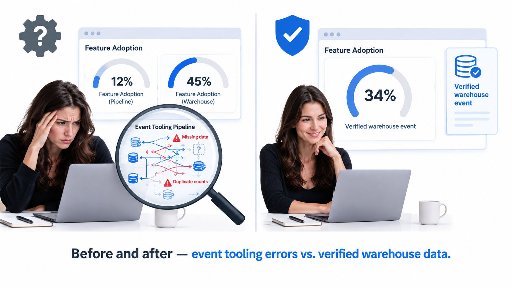
Where dashboard counts go wrong
A launched feature can look adopted when it isn't, or look dead when it has real traction. The usual failure modes are familiar:
Anonymous traffic inflates reach. A user opens the app before login, triggers an impression, then later signs in and appears again as an identified user.
Identity stitching happens late. First-use may be recorded under one identifier, repeat-use under another.
Entitlements are ignored. Teams divide by all active users, even when only a subset could access the feature.
Event retries create duplicates. Client-side tracking and server-side confirmation both fire, and nobody dedupes them cleanly.
BI dashboards smooth over lineage. A chart can't tell you whether “adopted” means clicked, completed, or returned.
Why the warehouse has to win
The warehouse is the only place where you can adjudicate those conflicts with raw event history, identity rules, model logic, and governed dimensions in one place. That's an architectural choice, not a tooling preference.
Practical rule: if adoption requires identity resolution, eligibility logic, exposure logging, or retention joins, the warehouse should own the metric definition.
This matters even more because modern adoption isn't uniform. A UK innovation survey cited in Adlega's discussion of adoption rate found that 56% of businesses were existing adopters of at least one technology, while 24% were existing diffusers. Adoption and diffusion are different behaviors. Inside a product, the equivalent mistake is collapsing exposure, trial, and workflow integration into one number.
Once you decide the warehouse is the system of record, the rest of the playbook gets cleaner. Funnel definitions stabilize. Cohorts make sense. Self-serve reporting stops arguing over whose dashboard is “right.”
The Adoption Funnel Most Teams Miss
Successful feature adoption requires a better framework than feature users divided by active users. That metric is easy to compute and almost useless for diagnosis. It hides whether the problem is that users never saw the feature, tried it once, or never came back.
A better model has four stages. The warehouse should prove each stage with distinct events and stable joins.
Four stages that matter
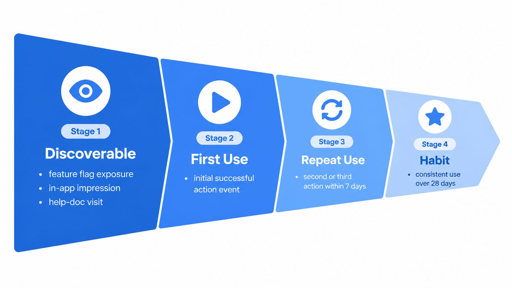
Discoverable
This is not “the feature exists in the UI.” It means the user had a plausible chance to notice it. In warehouse terms, that's a flag exposure, an in-app impression, a navigation view, or even a help-doc visit tied to identity.First-use
The user completes the first qualifying action successfully. Not a hover. Not opening a panel. A real action that expresses intent.Repeat-use
The user comes back and performs the same meaningful action again within a defined window. Teams often use a short post-exposure window for this. The point is to separate curiosity from early workflow fit.Habitual
The action keeps showing up across multiple usage periods. At this point, the feature has escaped launch novelty.
A quick walkthrough helps anchor the model:
Why clicks don't count
A single click is often just a failed attempt to understand the interface. Recent practitioner guidance summarized by TrackRaptor on feature adoption tracking mistakes argues that real adoption should be measured across discovery, first use, repeat use, and habitual use, not surface interactions. That same guidance emphasizes segmenting by eligible users or accounts, because role access and plan entitlements distort the denominator.
This is also why funnel modeling belongs alongside broader conversion funnel analysis, not inside an isolated feature report. Features don't live outside the product journey. They inherit friction from onboarding, permissions, data readiness, and account setup.
A feature with high first-click volume and weak repeat-use usually has a messaging win, not a product win.
The trade-off worth making
A stricter adoption definition will lower the headline number. That's good. Loose definitions produce comforting fiction.
Benchmarks are a useful check, but only if you read them with context. Umbrex's benchmark summary recommends measuring feature adoption as a funnel using breadth, depth, and time-to-adopt. It notes that a commonly cited benchmark is 50% of exposed users adopting within 7 to 14 days for well-designed features, while advanced or niche features often settle in the 5% to 20% range unless enablement is strong. Those ranges are only meaningful if your exposure and qualifying-use logic are sound.
Instrumenting Adoption Inside the Data Warehouse
Warehouse-first measurement only works if the event model is explicit. “We track it somewhere” isn't enough. The schema has to let you answer three separate questions without rewriting history: who was eligible, who was exposed, and who completed a meaningful action.
Core tables you actually need
Here's the minimum structure I'd want before calling a feature adoption metric trustworthy.
Table | Grain | Key Columns | Purpose |
|---|---|---|---|
events | one row per event | event_id, event_name, occurred_at, user_pseudo_id, user_id, ga_session_id | Raw product activity, including qualifying feature actions |
users_dim | one row per user | user_id, activated_at, plan, role, signup_cohort, is_internal | User attributes used for eligibility and segmentation |
accounts_dim | one row per account | account_id, plan_tier, lifecycle_stage | Account-level slicing and entitlement logic |
experiment_assignments | one row per user per experiment | experiment_name, variant, assigned_at, user_id | Holdout and treatment assignment |
flag_exposures | one row per exposure | feature_flag, exposed_at, user_pseudo_id, user_id | Evidence that a user could actually see the feature |
identity_map | one row per stitched identity pair | user_pseudo_id, user_id, stitched_at | Anonymous-to-known resolution |
sessions | one row per session | ga_session_id, session_started_at, user_id | Sessionized behavior and return analysis |
If your team is still doing most of this in a BI layer, move it down. This belongs in governed warehouse models and analytics engineering workflows like dbt. That's the foundation of reliable data warehouse analytics.
Rules that save you later
Three implementation choices decide whether the metric survives contact with real data.
Identity stitching first. Build a deterministic rule set for merging anonymous and authenticated events. Keep the raw IDs, but publish a canonical user key for downstream models.
Late-arriving event handling. Backfill windows matter. Mobile, browser retries, and batch uploads will otherwise mutate cohorts after you've already reviewed them.
Internal traffic exclusion. Add
is_internalor equivalent at the dimension level so every downstream model inherits the same exclusion logic.
A workable modeling pattern
The clean pattern is exposure-first.
Start with the set of eligible users for the feature. Join to flag_exposures or experiment_assignments so the denominator includes users who could reasonably adopt. Then join to the first qualifying action in events, using canonical identity, valid session logic, and exclusion filters.
In pseudo-SQL, the shape looks like this:
eligible users
exposed users
first qualifying action after exposure
second qualifying action inside the repeat window
habitual usage model on top
That layering matters. It lets you tighten or loosen the definition later without changing raw instrumentation. You can test whether “first-use” should mean one completed event or a compound workflow. You can also rebuild the metric when product changes the UX, which they will.
If the only adoption event you have is a client-side click, you don't have an adoption model. You have a UI interaction log.
Cohort and Funnel Analysis That Actually Answers Questions
A useful adoption review doesn't ask, “Is the line up?” It asks who converted, where they dropped, and what's different about the users who stayed.
The cohort key matters most. For feature adoption, use first exposure date, not signup date. If a feature launched after a user joined, signup cohorts mix exposed and unexposed users and make the chart unreadable.
Queries worth running every week
I keep a short list of questions that product, design, and data can all use without reinterpretation.
Question | Cohort Key | Time Window | Required Events |
|---|---|---|---|
How long does first-use take after exposure? | first exposure date | exposure to first qualifying use | flag exposure, qualifying action |
Which roles convert after seeing the feature? | first exposure date by role | short post-exposure window | exposure, qualifying action, users_dim role |
Which plans repeat use? | first exposure date by plan | repeat window | exposure, first use, second use |
Does activation path affect adoption? | first exposure date by activation path | exposure through repeat-use | exposure, qualifying action, activation source |
Where does the funnel leak? | first exposure date | full launch window | exposure, first use, repeat use, habitual threshold |
What stable models reveal
Cohort models should live in dbt or an equivalent modeling layer, not inside ad hoc dashboard formulas. Once you centralize them, you can support dashboards, experiments, and finance-adjacent analyses from the same logic.
That's where cohort analysis becomes operational instead of academic. You can look at median time-to-first-use by role, compare activation paths, and inspect whether repeat-use failure is concentrated in one plan tier or one onboarding path.
A good cohort read often exposes one of three problems:
Discoverability. Exposure is low among eligible users.
Usability. Exposure is fine, but first-use stalls.
Relevance. First-use happens, repeat-use fades.
Why this beats vanity reporting
Feature benchmarks are skewed enough that broad averages can mislead. Artisan Growth Strategies' benchmark roundup reports a median feature adoption rate of 6.4%, notes that only 6.4 out of 100 shipped features generate 80% of click volume, and cites 24.5% average core feature adoption across 181 SaaS companies. It also reports 6% average feature adoption for enterprise digital products, rising to 16% for best-in-class products.
Those numbers are useful for expectation-setting. They're not useful for diagnosis. Cohorts are.
Leading Indicators and Segmentation Levers
Retention takes time to settle. Product teams still need an early read. That's where leading indicators matter, but only if they're tied to meaningful actions instead of cosmetic engagement.
Signals worth trusting early
I care about four leading signals in the first post-exposure period:
Time-to-first-action. How quickly the user gets from exposure to a successful qualifying action.
Depth of exploration. Whether the user goes beyond the minimum path and touches adjacent capabilities.
Helper-event completion. Did they finish the setup, configuration, import, or permission step that enables value?
Second-session return. Did they come back and use the feature in another session, not just continue in the same burst?

These signals are more predictive than raw click-through because they capture effort and intent. A user who clears setup friction and returns in a later session is telling you more about future adoption than a user who opened the feature modal once.
Segmentation is where the work starts
Flat adoption curves are usually averages hiding distinct populations. One segment may love the feature. Another may never need it. A third may need it badly but can't get through setup.
Slice by:
Role when the feature changes workflow responsibility
Plan when access or data volume affects usefulness
Tenure when new users and mature users discover differently
Prior feature familiarity when this launch builds on an existing habit
Recent guidance summarized in Koji's feature adoption research framework argues that teams should pair usage data with interviews across active, tried-stopped, and never-tried segments. The point isn't just to collect feedback. It's to separate discovery problems from comprehension, motivation, and workflow-fit problems.
A low overall adoption number rarely describes one problem. It usually describes a blended audience.
The weekly review that changes behavior
A good weekly review is short and segmented. One page for leading indicators. One page for segment deltas. One page for open interventions.
If role A is exposed but slow to first-use, that's usually a comprehension issue. If plan B reaches first-use and never returns, the workflow may not justify the effort. If new users outperform tenured users, legacy habits are likely fighting the launch.
That's how segmentation turns a flat line into action.
Strategies That Move the Adoption Curve
Once the diagnosis is real, the intervention gets simpler. Most adoption improvements don't start with a rebuild. They start with onboarding, context, and experiment discipline tied back to warehouse-verified outcomes.
Onboarding fixes that earn their keep
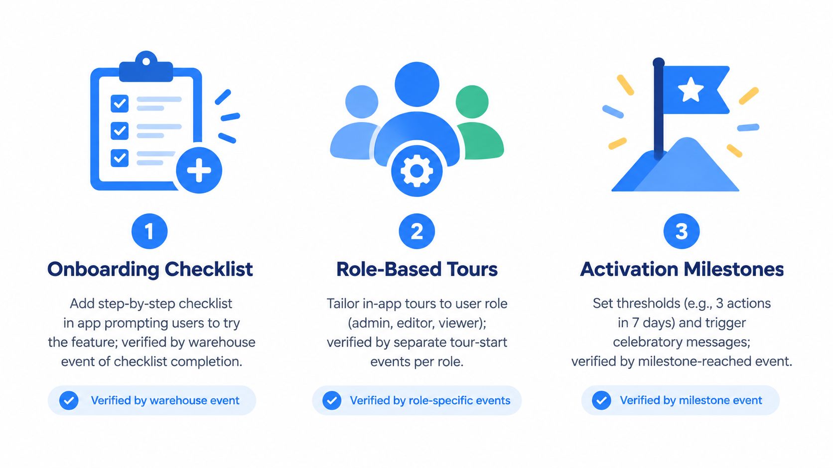
Use interventions that map cleanly to one broken stage in the funnel.
Checklists work when first-use is blocked by setup ambiguity. They're especially effective for features with prerequisite steps.
Role-based tours help when the same feature serves admins, operators, and viewers differently.
Activation milestones matter when users need reinforcement after the first successful outcome.
I'd rather ship a narrow checklist tied to one friction point than a full product tour nobody finishes.
Nudges need instrumentation too
In-app prompts often “work” in a loose sense, but many teams can't prove which message moved behavior because they didn't log the exposure, dismissal, and follow-on usage path. That makes post-launch analysis fuzzy fast.
Before shipping a nudge, define:
the audience rule
the exposure event
the success event
the holdout population
the re-analysis path in the warehouse
That same discipline applies if you're using prioritization inputs from product research or tools. Teams exploring AI tools for product feature prioritization can use them to rank opportunities, but the follow-through still depends on warehouse-grade exposure and outcome data.
Experiments beat launch folklore
A lot of feature adoption lore is just memory plus a chart screenshot. Run experiments instead.
Write assignment and exposure to the warehouse. Keep the cohort logic identical to the monitoring logic. Read treatment effects from the same models you use for baseline adoption reporting. If you use a self-serve layer such as Querio for warehouse-native exploration, the important part isn't the interface. It's that PMs and analysts are reading from the same governed event models rather than recreating funnel logic in separate tools.
Here's the pre-launch instrumentation checklist I won't skip:
Canonical event names for exposure, qualifying use, repeat-use, and milestone events
Identity stitching rules documented before release
Flag and experiment logging written back to warehouse tables
Internal and test account filters available at the dimension level
Versioning notes so UX changes don't redefine success
If that list isn't ready, the experiment result won't be trustworthy.
The Self-Serve Analytics Playbook for Data Teams
The durable fix is operational, not just analytical. Feature adoption becomes manageable when data teams turn it into a governed self-serve system instead of a repeating Slack request.
Three layers that keep the system sane
Start with a semantic layer. Define certified adoption metrics, name the owner, and distinguish stable metrics from experimental ones. Everyone should know which version belongs in launch reviews and board slides.
Next, publish a warehouse-native metric catalog that exposes adoption definitions to PMs, designers, and growth. If users can inspect the event definition, cohort key, and denominator logic without asking an analyst, debates get shorter.
Then add request intake rules. Some questions are routable in self-serve. Others need engineering work because they involve missing events, broken joins, or entitlement changes. Good self-serve isn't “ask anything.” It's “ask what the data model can answer reliably.”
A broader data and intelligence operating model helps here because feature adoption cuts across product analytics, experimentation, and stakeholder access.
Guardrails that prevent metric drift
A few controls do most of the work:
Row-level access policies in the warehouse for account-sensitive analysis
Feature-flag to metric mapping so every launch has a traceable denominator
Weekly adoption review with product, design, and a data partner
Certified models first. BI should consume them, not redefine them
What changes over one quarter
In the first month, standardize event names and publish one certified funnel for one feature class.
In the second, add exposure logging, segment tables, and a stable cohort model keyed on first exposure.
In the third, connect experiments and self-serve access so PMs can inspect results without waiting on custom pulls.
That's when the flywheel starts. New analysts onboard faster because definitions exist. PMs stop opening duplicate dashboard debates. Data engineering spends less time explaining numbers and more time improving the system that produces them. Feature adoption stops being a recurring ticket and becomes part of the operating model.
Querio gives data teams a warehouse-native way to turn adoption analysis into a self-serve system instead of another dashboard argument. If you want PMs and operators to explore governed funnel, cohort, and experiment models without turning your analysts into a human API, visit Querio.