Graphs or Tables: A Decision Guide for Analytics Teams
Should you use graphs or tables? A decision-focused guide for analytics teams covering use cases, design rules, accessibility, and a quick decision checklist.
published
Outrank AI
graphs or tables, data visualization, analytics, BI dashboards, reporting
a7dcc4a5-5a81-424e-8e38-750003053bc9

Many teams reach for a chart because charts feel modern, decisive, and executive-friendly. That reflex is often wrong. If the audience needs to verify a number, compare exact values, or cross-check a metric against another source, tables are usually the more trustworthy default, and the push to “always visualize” can make the point harder to audit, not easier. Public guidance says tables are better for precise values while figures are better for patterns, and health-communication guidance also asks whether a graph is needed at all, with reporting guidance warning that primary outcome data should not be shown in figures alone. The same guidance points to a stricter standard than most dashboard culture admits, which is one reason reporting still breaks when teams choose style before task.
A good analytics lead doesn't ask, “Should this be a graph or a table?” first. The better question is, “What does the reader need to do with this data?” That shift changes the entire design choice. A board member who needs to audit a number, a product manager who wants to spot a trend, and an analyst who is hunting an outlier are not solving the same problem, so they shouldn't get the same format.
Querio's business intelligence reporting approach fits that operational mindset, because reporting only works when the format supports the decision, not when it merely looks polished.
Table of Contents
The Default Should Be a Table, Not a Chart
Charts dominate presentations because slides reward speed of recognition, not verification. That habit leaks into dashboards, where it becomes risky. If the user has to answer, “What exactly is the value, and can I trust it?”, a table gives them a direct path to the answer, while a chart asks them to estimate, interpret, and often guess.
Trust starts with auditability
A table is easier to audit because the number sits in plain view beside its label. A figure can still be useful, but only when the point is to show shape, not precise values. That distinction matters more than visual polish, because the wrong format can hide the question the stakeholder came to answer.
Practical rule: if the user will quote the number, reconcile it, or compare it against a source system, start with a table.
That does not mean charts are bad. It means charts are specialized. Health-communication guidance recommends asking whether a graph is needed at all, and it also pushes teams to streamline toward one main message rather than adding visual clutter. In reporting contexts, that advice aligns with a conservative analytics principle, don't hide primary outcome data inside a figure if the audience needs to inspect it directly. The underlying guidance is stricter than most dashboard templates are willing to be.
The reflex came from presentation culture
“Always visualize” made sense in rooms where the audience was passively watching a presenter. It makes less sense in self-serve analytics, where the user is trying to decide, validate, and move on. A chart is persuasive when attention is the goal. A table is safer when truth-telling is the goal.
The decision task should drive the format:
Exact comparison favors tables.
Trend detection favors graphs.
Outlier spotting often favors graphs first, then a table for verification.
Cross-checking across metrics usually favors tables, especially when the audience needs to reconcile multiple measures.
That is the cleaner rule, and it is the one most dashboards fail to follow. If your team keeps defaulting to charts, treat that as a design smell, not a virtue.
For reporting systems that need both presentation and verification, see business intelligence reporting patterns that separate the summary layer from the audit layer.
What Graphs and Tables Do for the Reader
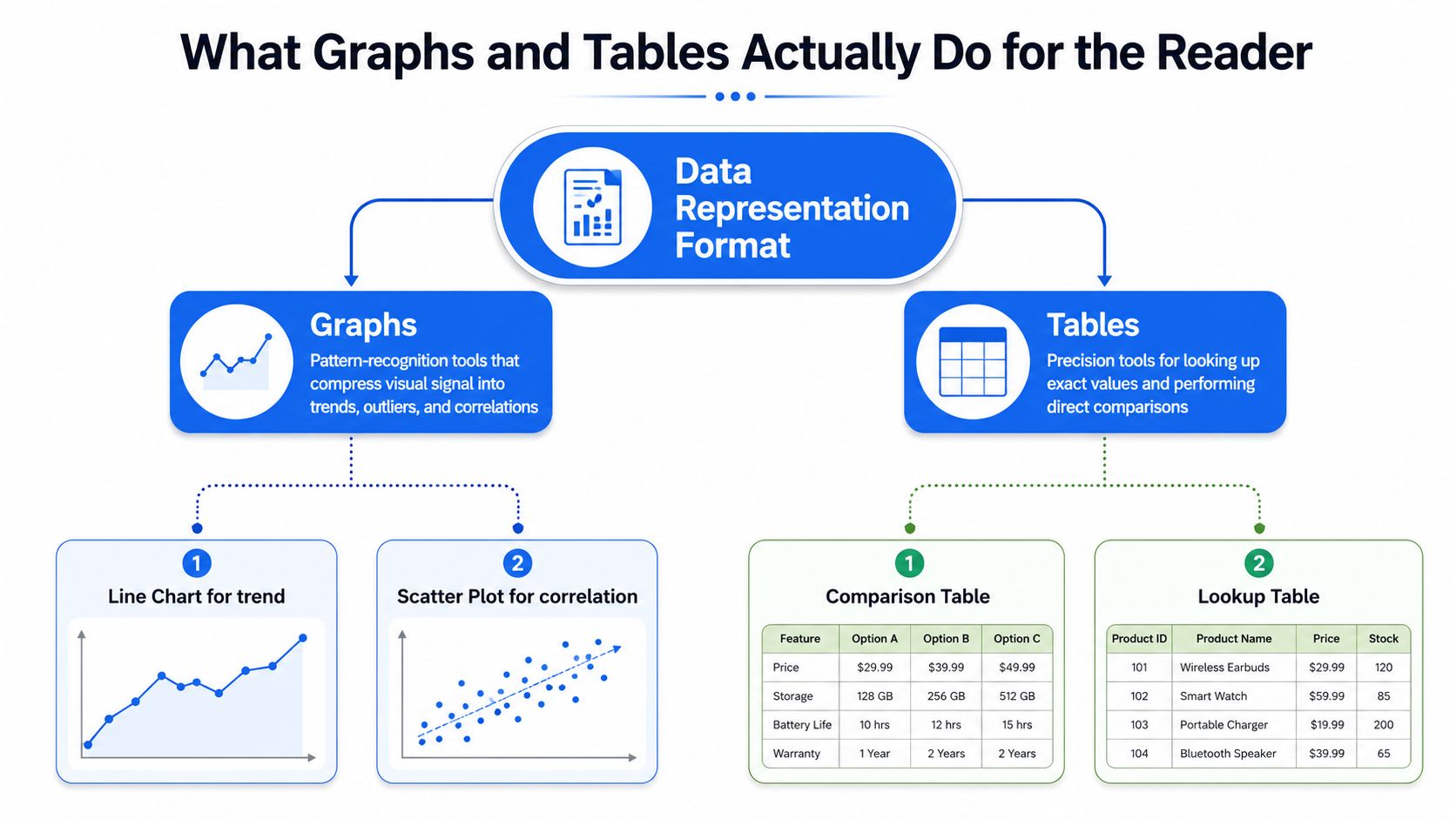
Graphs and tables are not two styles of the same thing. They ask the reader's brain to do different work. A graph compresses information into shape, which is why it is better at showing movement, clustering, and irregularity. A table keeps values explicit, which is why it is better when someone needs to inspect a figure, compare it row by row, or check it against another record.
Two cognitive tools, not one visual palette
The split is easier to defend when you frame it as a task choice. Graphs are pattern-recognition tools. Tables are lookup tools. That is why the same dataset can be honest in one format and misleading in another. A graph may make a trend obvious, while a table may show that the change is too small to matter without context.
For analytics teams, the practical classification is simple:
Exact comparison means the reader must compare values directly.
Trend detection means the reader must see direction over time.
Outlier spotting means the reader must notice an unusual point quickly.
Cross-checking across measures means the reader must verify consistency across dimensions.
A line chart helps with the second task. A comparison table helps with the first and fourth. A scatter plot can surface an outlier or odd cluster, but a table is still where many readers go to verify the actual numbers.
This chart interpretation guide is useful here, because reading a chart well is not the same as choosing one well.
The honest test is what happens after the first glance
If the user glances once and then needs to confirm, a table will usually serve them better. If they need to see a pattern at a glance, a graph earns its place. When teams ignore that split, they produce visuals that look informative but do not support action.
A display is only useful when the reader can do the next job without translating it twice.
That is the standard to apply during review. If the question is “What happened?” a graph can answer quickly. If the question is “What exactly happened?” a table is the more durable choice.
Matching the Format to the Decision Task
The cleanest way to stop arguing about graphs or tables is to bind each format to the task. Once you do that, the debate becomes practical instead of aesthetic. You stop asking which one is prettier and start asking which one helps the reader decide faster and with less error.
Format Fit by Decision Task
Decision Task | Graph Strength | Table Strength | Failure Mode |
|---|---|---|---|
Exact comparison | Weak, because the eye estimates | Strong, because values are explicit | Graphs encourage approximation when precision matters |
Trend detection | Strong, because shape is obvious | Weak, because the reader has to scan row by row | Tables hide direction unless the reader already knows what to look for |
Outlier spotting | Strong for quick scanning | Strong for confirmation after detection | Tables can bury anomalies in dense rows |
Cross-checking | Moderate, if the relationship is simple | Strong, because multiple fields sit side by side | Graphs can oversimplify the reconciliation step |
Exact comparison and cross-checking belong to tables
If someone needs to compare revenue by segment, inspect variance across groups, or validate a metric before sharing it, a table is the natural fit. It keeps the value visible and minimizes interpretation errors. The format is especially strong when the audience cares about traceability, because a table lets them inspect row, label, and figure together.
Trends and anomalies belong to graphs first
Graphs win when the reader needs to see direction, momentum, or change over time. A line chart or bar chart can reveal what a table would force the reader to calculate mentally. That matters when the audience is scanning for a signal rather than documenting a number.
Querio's chart-selection guidance is relevant here because the wrong chart choice creates the same problem as the wrong chart-versus-table choice, extra effort for the reader.
The hybrid is often the right compromise
A compact chart next to a supporting table gives you both speed and verification. Use the chart to orient the reader, then let the table answer the follow-up question. That pattern works especially well when stakeholders are likely to ask, “Which segment drove this?” right after seeing the trend.
The trap is trying to force one format to do everything. Don't. Pick the task, then pick the tool.
Use Cases From a Real Analytics Workflow
Theory gets tested in the weekly rhythm of a real team. A product metrics review, a retention analysis, and a board summary all contain numbers, but they don't ask the same question. If you force one visual style onto all three, you usually get either pretty confusion or ugly accuracy.
Weekly product metrics review
For a product review, a line chart for the primary KPI and a small supporting table for segment breakdowns is often the right balance. The chart lets the team see whether the metric is moving in the expected direction. The table answers the immediate follow-up, which segment, channel, or platform is responsible.
A rough wireframe would be a single trend chart at the top, then a compact table underneath with rows for major segments and columns for the current period, prior period, and notes. That keeps the review fast without making the numbers opaque.
Cohort retention analysis
Retention work usually benefits from a table first, especially when the team needs to compare cohorts across time windows or inspect exact percentages by row. A heatmap can help surface shape, but the table is the source of truth when the analyst needs to verify a cohort's actual path. In practice, many teams use both, a visual layer for pattern recognition and a tabular layer for inspection.
Executive summary board pack
Board materials should lean conservative. If a metric is being used for decision-making or accountability, a table is often the better primary view because it keeps the number auditable. A chart can still play a supporting role when the audience needs context, but it shouldn't be the only place where the core figure lives.
If the room is asking for confidence, not discovery, lead with the table.
That rule is especially useful when you're packaging the same metric for different audiences. A product team may want the chart first. A board may want the table first. That isn't inconsistency, it's respect for the job each audience is hiring the report to do.
For teams that need to extract these examples from source systems quickly, using the Instant Data Scraper extension can help pull structured page data into a format that's easier to inspect before deciding whether the final view should be tabular or graphical.
Design, Interaction, Accessibility, and Performance
Choosing the right format is only half the fight. A weakly designed table can be just as hard to read as a cluttered chart, and a beautiful chart can still fail if the interaction model blocks inspection. The question is not just what to show, it's how to let people work with it.
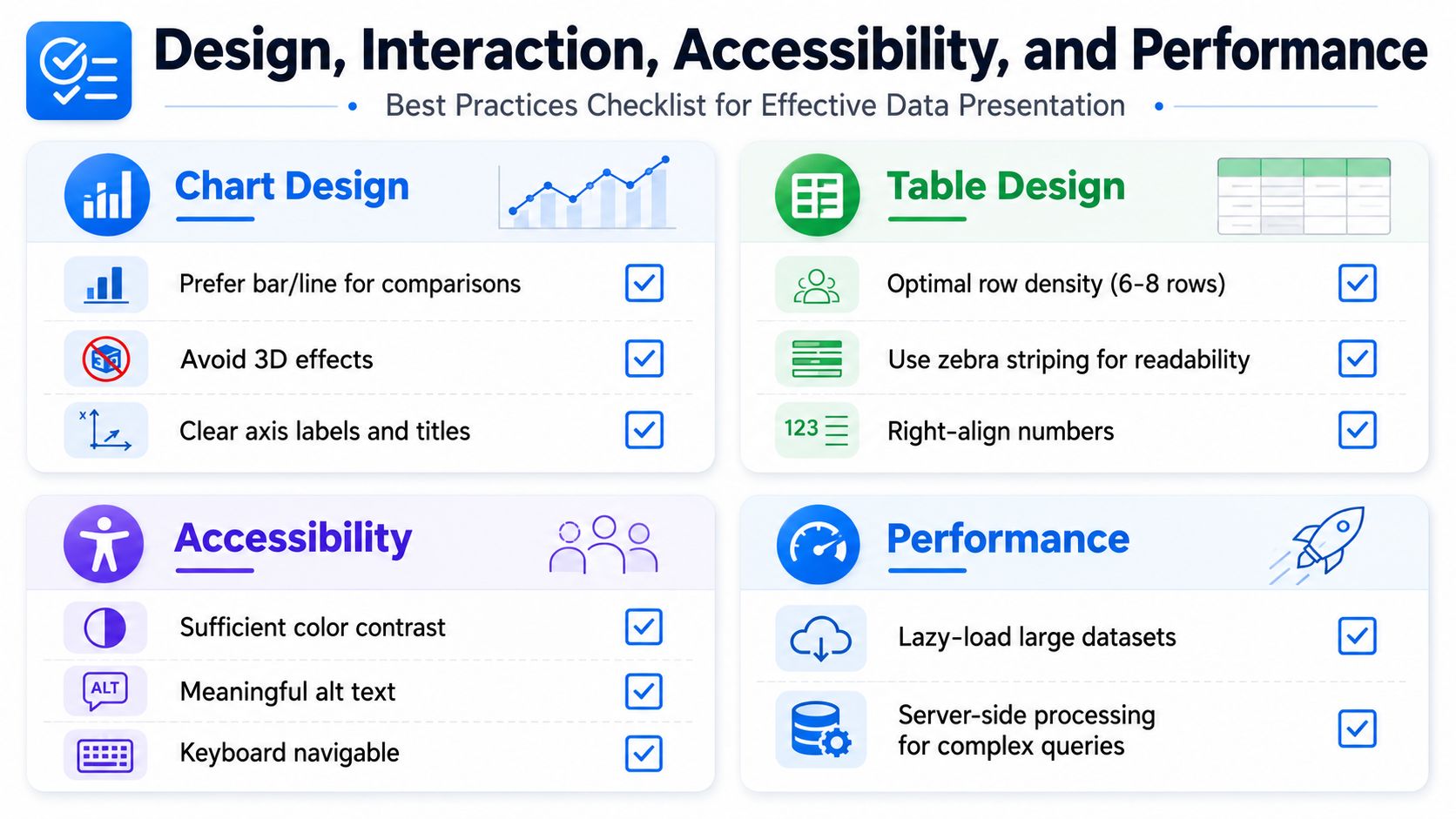
Chart and table design should reduce friction
Use bar charts or line charts for comparisons and trends, because they map well to human perception. Avoid 3D effects, which distort reading without adding meaning. Keep axis labels clear and titles specific so the reader doesn't have to infer the unit or time frame.
For tables, density matters. If a table is overloaded, the reader stops scanning and starts hunting. Right-align numbers, use zebra striping for readability, and keep row density comfortable enough that the eye can move across columns without losing the line.
Interaction changes the choice
Sorting, filtering, and drill-down make tables more powerful because they preserve exact values while giving the reader control. Tooltips can help graphs by exposing precise values on demand, but they shouldn't be the only way to access the number if the user needs to audit it. If a dashboard depends on interaction to make the data legible, the base layer still has to stand on its own.
Accessibility and performance are part of the decision
Charts can be harder for screen readers if the alt text is vague or the data is encoded mainly by color. Tables can be easier to use with assistive technology when the markup is clean and the structure is obvious. For keyboard users, the interaction path matters just as much as the visual design.
If you need a practical review of implementation details, Querio's data visualization best practices are a useful reference point for teams standardizing chart and table behavior across dashboards. On the data-extraction side, what web data really means is a helpful companion read when a team is deciding how raw data should be structured before it ever reaches a chart or table.
Performance matters too. Large tables can stress warehouse-backed queries if every filter and sort is pushed blindly to the client, while rendered chart pixels can hide complexity that the system still has to compute. The better design is the one that stays inspectable without making the page sluggish or the interface fragile.
Pros and Cons You Should Stop Skipping
The usual pros-and-cons list is too shallow. The core trade-off is not visual versus numeric. It is attention versus precision, speed versus auditability, and persuasion versus verification. Once that is clear, the choice stops being ideological and becomes operational.
Graphs are fast to read, but loose to inspect
Graphs work best when the reader needs to see pattern, direction, or relative movement. They are weaker when the reader needs exactness. A chart can be a strong opener and a poor final artifact.
Tables make the opposite trade-off. They are slower to skim, but they are stronger when the number itself matters. A table also makes cross-checking easier, because the value sits next to the label and can be reconciled without mental translation.
The auditability argument matters more than teams admit
A table is the safer default when the audience needs to audit a number or compare it against another source. That does not make charts untrustworthy. It means charts are not the right primary medium when the job is accountability. Guidance on reporting and figure use has made the same point, primary outcome data should not be left inside figures alone when readers need the underlying value in front of them, The guidance supports a stricter standard than most dashboard habits do.
Breaking the rule can still be right
A chart used only to set context in a live presentation is defensible, even if the underlying table is where the actual decision gets made. The presentation moment is about orientation, not retrieval. The mistake is not using a chart. The mistake is treating the chart as sufficient when the reader later needs to check the number.
A compact decision list helps here:
Use a graph when the audience needs a pattern quickly.
Use a table when the audience needs exact values or audit trails.
Use both when the reader will ask for context first and proof second.
That is the honest way to think about it, and it keeps you from overdesigning for the wrong kind of attention.
Decision Checklist and Recommendation Matrix
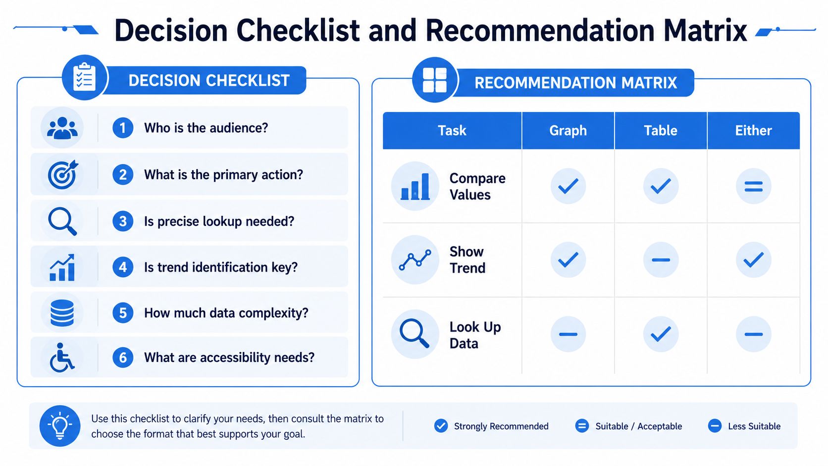
Run this check before you publish a dashboard or board pack. If the answer points to verification, choose a table. If it points to pattern recognition, choose a graph. If it points in both directions, use a hybrid and make the primary task obvious.
Six questions to settle the choice
Who is the audience? Executives, analysts, and operators often need different formats.
What is the primary action? Compare, verify, summarize, or investigate.
Is precise lookup needed? If yes, the table usually wins.
Is trend identification key? If yes, start with a graph.
How much data complexity is present? More complexity often pushes you toward a table with filtering.
What are accessibility needs? If screen-reader or keyboard use matters, design for direct inspection.
Quick recommendation matrix
Task | Recommended format |
|---|---|
Compare values | Table |
Show trend | Graph |
Look up data | Table |
Set context quickly | Graph |
Support auditability | Table |
Combine pattern and proof | Both |
Use this as a default rule, not a law. If the reader needs to act on the data, the format should make the action easier, not just the slide prettier. That's the standard worth defending in every dashboard review.
If your team is still debating graphs or tables in every reporting cycle, make the decision with the checklist above, then build the view around the task instead of the style. If you want a workspace that helps teams query, inspect, and present warehouse data without waiting on a handoff, take a look at Querio.