Analytics and Reporting Explained for Data Teams
Learn how analytics and reporting differ, connect, and scale. Explore workflows, KPIs, and self-serve best practices for analytics and reporting.
https://www.youtube.com/watch?v=lgCNTuLBMK4
published
Outrank AI
analytics and reporting, self-serve analytics, reporting best practices, data analytics guide, business intelligence
5576692f-a543-4d94-aaa3-66320f17454c

A founder opens the weekly dashboard and sees healthy revenue. The product manager opens a different dashboard and sees declining activation. An analyst is asked to reconcile the two numbers, then discovers that each team defines an active customer differently. By the time the disagreement is resolved, the meeting has ended and nobody has decided what to change.
This is the common failure mode of analytics and reporting. The company has data, charts, and reporting software, but the information still doesn't move reliably from a question to a decision. Reporting gets blamed for being too slow, analytics gets blamed for being too complex, and the data team becomes a human API for every routine request. A useful overview of the broader discipline is available in this guide to business intelligence and analytics.
The confusion usually starts with treating reporting and analytics as interchangeable words. They aren't. Reporting gives people a consistent view of performance. Analytics helps them investigate meaning, causes, alternatives, and next actions. When teams separate those jobs and connect them deliberately, dashboards become part of an operating system rather than a gallery of charts.
Table of Contents
Understanding Analytics and Reporting and How They Work Together
How Analytics and Reporting Workflows Flow From Question to Decision
Key Metrics KPIs and Benchmarks That Make Reports Actionable
Roles and Responsibilities Behind Effective Analytics and Reporting
Best Practices for Self Serve Analytics and Trustworthy Reporting
Introduction Why Analytics and Reporting Get Confused
A report answers a recurring question in a stable format. How much revenue did the business generate? How many users completed onboarding? Which channels contributed to pipeline? People can review the answer on a schedule because the metric, time window, filters, and audience have already been defined.
Analytics begins when the answer raises a better question. Revenue fell, but was the change concentrated in one market? Activation declined, but did a product release alter the onboarding path? Pipeline grew, but did deal quality improve or did the team create more low-intent opportunities?
The distinction matters because the two activities need different levels of flexibility. A weekly executive report should be predictable. An investigation into a sudden retention change should allow the analyst to segment users, test assumptions, join product and commercial data, and follow unexpected findings.
Practical rule: Use reporting to notice a signal, and analytics to decide what the signal means.
Teams waste time when they ask one artifact to perform both jobs. A dashboard overloaded with every possible dimension becomes difficult to read and slow to maintain. A one-off analysis that contains a valuable discovery may never become part of the recurring management rhythm. The result is duplicated logic, conflicting definitions, and decisions that depend on whoever happens to know where the latest spreadsheet lives.
The solution isn't to produce more dashboards. It's to create a clear chain from measurement to interpretation to action. A report should make an important change visible. An analytical workflow should explain the change and identify an owner. The resulting decision should then influence what the team monitors next.
That chain has become more important as reporting moves closer to everyday operations. Founders need a compact view of business health, product managers need evidence for prioritization, and data teams need to provide access without sacrificing consistency. The rest of this guide treats analytics and reporting as a connected capability built on clear questions, reliable definitions, explicit ownership, and a path into execution.
Understanding Analytics and Reporting and How They Work Together
The simplest analogy is a car. Reporting is the dashboard. It shows speed, fuel, warnings, and other selected indicators in a form the driver can read quickly. Analytics is the diagnostic engine. It helps explain why a warning appeared, which system caused it, and what repair or adjustment may be appropriate.

Capability | Main question | Typical output | Best use |
|---|---|---|---|
Reporting | What happened? | KPI summary, trend, exception alert | Monitor recurring performance |
Analytics | Why did it happen? | Segmentation, comparison, root-cause analysis | Investigate a change |
Decision support | What should we do? | Recommendation, experiment, operational task | Turn insight into action |
Suppose a subscription product reports a fall in trial-to-paid conversion. The report should state the change clearly, preserve the agreed definition, and show enough context for the team to recognize that the result deserves attention. Analytics then breaks the result down by acquisition source, plan, device, onboarding step, and cohort. The goal isn't to find an interesting pattern. The goal is to identify a plausible cause that a team can test or address.
This makes the relationship cyclical rather than linear. Reporting surfaces a signal. Analytics investigates it. A product, marketing, or commercial team acts. The report is then refined if the decision requires a new indicator, segment, or alert.
A report can also contain analytical features, such as drill-downs or comparisons, and an analysis can become a recurring report. The labels aren't the important part. The important question is whether the artifact supports repeatable monitoring, open investigation, or concrete action.
The market context reflects this broader role. Global business analysis and reporting spend was estimated at $15.7 billion in 2023, with forecasts pointing to 11.2% annual growth from 2024 through 2031. Other market trackers place the broader business intelligence and data analytics market at $25.01 billion in 2022 and project it to reach $43.5 billion by 2028. North America held the largest share of the business analysis reporting market in 2023 at 38%, according to market reporting industry estimates.
The practical implication is straightforward. A dashboard isn't valuable because it looks polished. It's valuable when it helps someone recognize a meaningful condition, investigate it with confidence, and choose a response. For a closer look at the descriptive layer of this work, see what descriptive analytics means.
How Analytics and Reporting Workflows Flow From Question to Decision
A dependable workflow starts before anyone opens a dashboard. It starts with the decision a person needs to make.
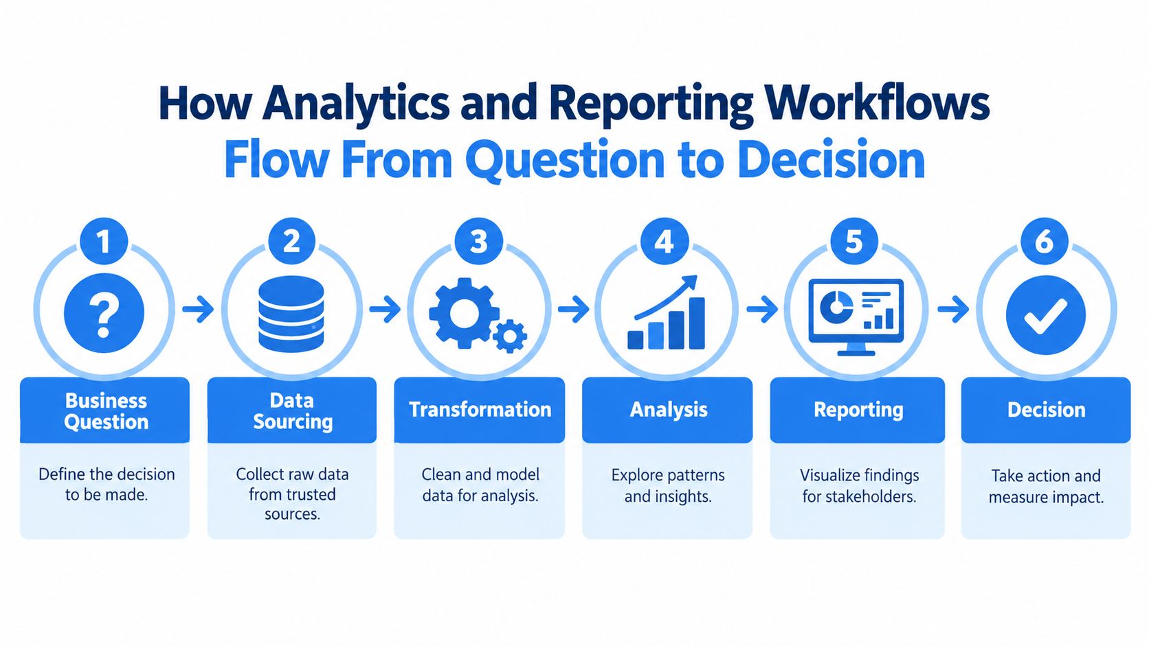
Start with the decision
“Show me product usage” is too broad to guide useful work. “Should we redesign the onboarding checklist for new accounts?” identifies a decision, an audience, and a likely population to analyze. The question determines which data matters and prevents the team from collecting every available field because it exists.
Trace the data to trusted sources
Next, identify the systems that contain the evidence. Product events may live in a warehouse, billing details in a payment system, and customer ownership in a CRM. The team should document how those sources connect and which one is authoritative for each business concept.
Transform raw records into usable data
Raw tables rarely match the language used in a decision. Analysts and engineers may need to clean event names, standardize timestamps, connect accounts to users, and model a funnel. Reusable transformations reduce the chance that each investigation creates a different version of the same logic.
Explore before publishing
Analysis is where the team tests explanations. Segment the result, compare cohorts, examine changes over time, and check whether the apparent pattern survives reasonable filters. An exploratory notebook or workspace often works better than a fixed dashboard at this stage because the question is still evolving.
Report the conclusion to the right audience
The final report shouldn't expose every analytical turn. It should show the relevant metric, context, interpretation, and decision point. A product review may need a funnel and cohort view, while an executive update may need a short trend with a clear owner.
Activate and measure the response
The workflow ends with action, not publication. Assign the decision to a team, record what changed, and monitor whether the chosen intervention affected the relevant outcome. If the data never reaches a workflow, the report is informative but operationally incomplete.
A practical plain-English-to-live-dashboard workflow can help teams reduce the translation gap between business questions and technical reporting work.
The last mile deserves special attention. Research cited by Supermetrics on the AI readiness gap found that 40% of SMB teams and 34% of enterprise teams identify missing integration between analytics tools and activation platforms as their biggest blocker. The same source reports that 41% of in-house marketers report results without analyzing causes or identifying actions. These findings point to a workflow problem, not merely a charting problem.
When a handoff fails, ask where it failed. Was the question vague? Was the source incomplete? Did two teams apply different definitions? Did the analyst explain the result without naming an owner? That diagnosis is more useful than replacing the visualization.
Key Metrics KPIs and Benchmarks That Make Reports Actionable
A metric describes something measurable. A key performance indicator, or KPI, is a metric tied to an important outcome and a decision. Many teams track dozens of metrics but assign no owner to them, so the report grows while accountability stays unchanged.
Start with the decision, then select the smallest set of indicators that can inform it. A product manager deciding whether onboarding works might need completion, time to first value, and early retention. A founder reviewing commercial health may need bookings, conversion through the funnel, and customer quality. The right set depends on the decision, not on the fields available in the warehouse.
Separate signals from outcomes
Lagging indicators show what already happened, such as paid conversion or recognized revenue. Leading indicators provide earlier evidence about future performance, such as completion of a setup step or qualified activity from a target account. Neither category is automatically superior. A report becomes more useful when it connects the early signal to the later outcome and makes the relationship understandable.
Metric Type | Purpose | Example Use |
|---|---|---|
Outcome metric | Shows whether the strategic result occurred | Assess whether retention improved |
Leading indicator | Signals movement before the outcome is visible | Monitor completion of a key activation step |
Diagnostic metric | Helps explain a change | Compare conversion by channel or device |
Guardrail metric | Prevents a local improvement from causing harm elsewhere | Check support volume after a product change |
Use context, not isolated targets
Absolute numbers can mislead when the underlying mix changes. A conversion rate may fall because traffic shifted toward a lower-converting channel, not because the product became less effective. Segment reports by comparable dimensions such as channel, geography, or device before interpreting a change.
Benchmarking works best inside recurring reports. Google Analytics benchmarking can place a property's trendline beside the peer-group median and peer-group range, creating distribution-aware context rather than a single target comparison, as described in Google Analytics benchmarking documentation. This approach helps teams distinguish a genuine performance issue from a structural difference in audience or mix.
Set target bands where variation is expected, and explain what action each band triggers. A red status without a response owner is decoration. A range connected to a named decision becomes an operating control.
For practical guidance on connecting measures to business outcomes, see how to measure key performance indicators. A well-designed report should let a reader answer three questions quickly: what changed, why might it have changed, and who decides what happens next?
Roles and Responsibilities Behind Effective Analytics and Reporting
A reliable reporting system depends on a human operating model. The founder frames the business question and makes trade-offs. The product manager defines the user behavior or product outcome that needs attention. The analyst investigates patterns and explains uncertainty. The data engineer maintains collection, transformations, and performance. The head of data aligns definitions, access, quality, and priorities.
Problems start when these responsibilities collapse into one overloaded data team. Every request arrives as “Can you pull a number?” The analyst has to interpret the question, locate the source, write the query, validate the result, explain the caveats, and sometimes chase the decision-maker for follow-up. The team becomes a bottleneck because knowledge remains trapped in individual requests.

Replace the human API with clear ownership
A useful operating model separates definition ownership from technical stewardship. A product leader may own what “activated account” means for a product decision, while the data team owns how that definition is implemented, tested, documented, and exposed.
A lightweight responsibility map can clarify the handoffs:
Founder or executive: chooses the business priority and accepts the decision trade-off.
Product manager: defines the product question, population, and intended action.
Analyst: tests explanations, communicates limitations, and recommends useful cuts.
Data engineer: maintains pipelines, models, reliability, and source connections.
Head of data: governs shared definitions, access rules, and the reporting portfolio.
Self-service doesn't mean sending every stakeholder directly into raw tables. It means giving business users safe paths to explore while data professionals maintain the infrastructure and common language underneath.
Adoption is the test of whether that design works. In a global survey of 214 companies, BARC and Eckerson Group found that only 25% of employees were actively using BI and analytics tools on average, with minimal growth over seven years of tracking, according to their research on BI and analytics adoption.
That result should change how leaders evaluate success. A purchased license isn't adoption. Adoption means people can find a trusted metric, understand its scope, answer a routine question, and know when to involve an analyst. Training, documentation, office hours, and visible executive use all reinforce that behavior.
Best Practices for Self Serve Analytics and Trustworthy Reporting
Buying a BI platform doesn't create self-service analytics. Without shared definitions and reliable access, it creates more places where users can calculate the same metric differently.
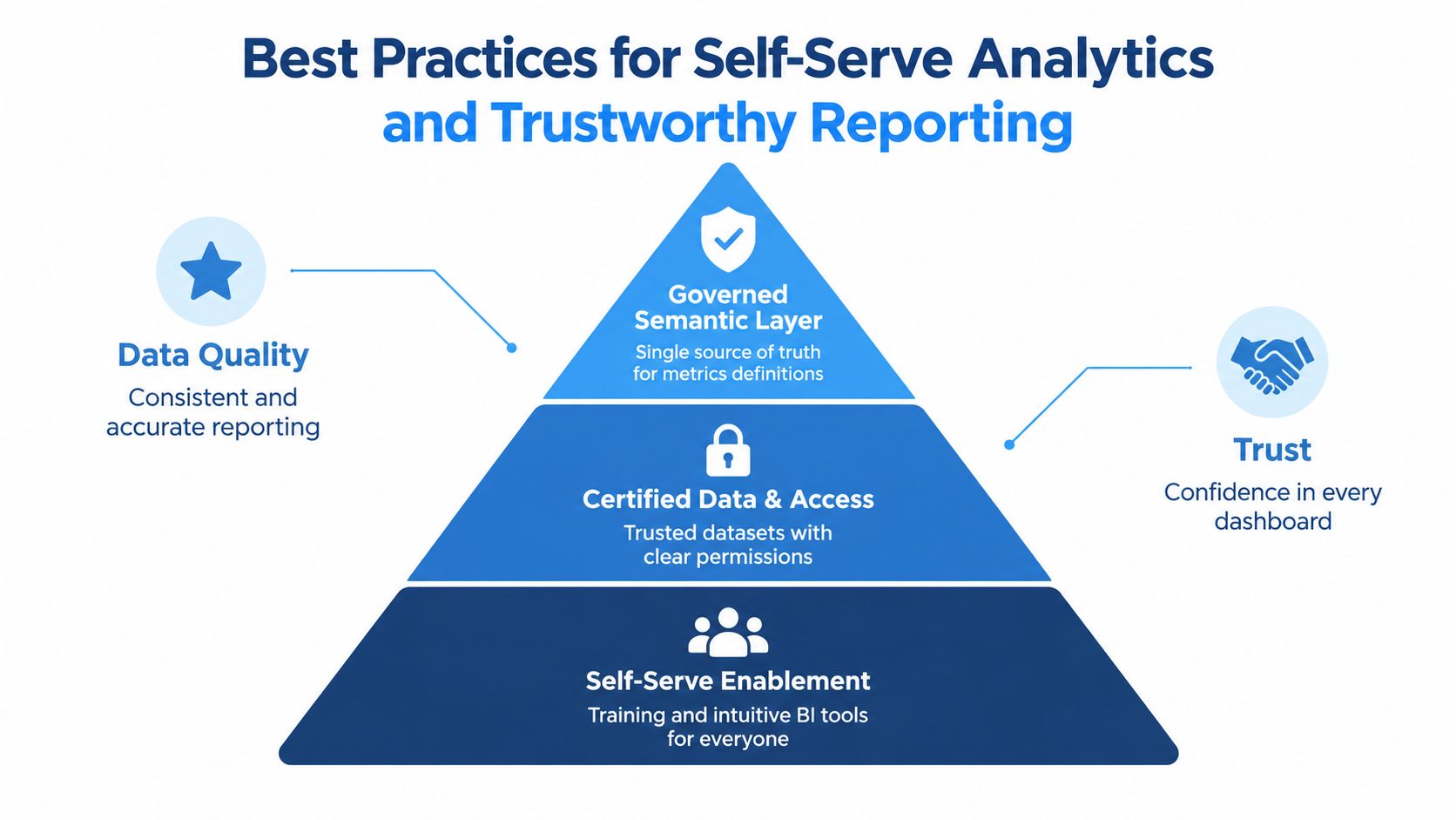
Put the semantic layer between storage and presentation
A governed semantic layer converts warehouse tables into standardized metrics, dimensions, joins, and security rules. It sits between the warehouse and reporting tools, so the warehouse remains the system of record while the semantic layer controls how people interpret and access data.
That arrangement prevents every dashboard or notebook from rebuilding revenue, churn, or active-user logic independently. Analysts and business users can query the same definitions, reducing metric drift and the recurring “why doesn't this number match?” discussion. The guide to governed self-service analytics describes this layer as a control point for consistent semantics and access control.
Make trust visible
A trustworthy reporting environment needs more than permissions. Teams should know which datasets are certified, when they were refreshed, who owns a definition, and what limitations apply. Testing should cover both the underlying data and the BI artifacts that present it.
Self-service enablement then becomes practical rather than rhetorical:
Certified datasets: Give users a small set of clearly named, maintained starting points.
Reusable definitions: Publish metric descriptions, grain, filters, and exclusions beside the metric.
Safe exploration: Let users segment and compare data without granting unrestricted access to sensitive records.
Feedback loops: Capture questions that recur, then turn useful answers into governed assets.
Operational delivery: Send important results into the channels and workflows where teams already work.
BARC's 2025 trend survey keeps security, quality, and governance central as AI and automation become more important, while Wiiisdom's 2025 governance report says few organizations have automated continuous testing and certification for BI artifacts, as summarized in BARC's BI Trend Monitor 2025.
The principle is simple: faster generation increases the need for verification. AI can help produce an analysis, but teams still need reproducible definitions, lineage, access controls, and a way to certify what others will rely on.
Streamlining Reporting With Modern Platforms Like Querio
A modern reporting stack should reduce translation work without hiding the reasoning behind a result. Start by checking whether a user can ask a business question in familiar language, trace the answer to governed data, inspect the analysis, and share the conclusion with the people responsible for acting.
A practical evaluation can focus on five tests:
Question fit: Can the system represent the decision, not just display a predefined chart?
Warehouse connection: Does it work from the company's governed data rather than creating an isolated copy?
Reusable logic: Can teams preserve metric definitions, joins, filters, and assumptions?
Collaboration: Can technical and non-technical users review the same analysis and results?
Activation: Can findings reach a recurring report, team channel, customer experience, or operational workflow?
Querio is one example of this approach. It deploys AI coding agents directly on a data warehouse and uses a file-system approach with custom Python notebooks, allowing technical and non-technical users to query, analyze, and build on company data while data teams maintain self-service infrastructure. For teams comparing reporting options, a focused SEO reporting tool can also be useful when the reporting problem is specifically tied to search performance and marketing workflows.
The platform choice still matters less than the design around it. Define the metric before building the chart. Assign an owner before publishing the report. Certify the data before inviting broad use. Connect the result to an action before calling the workflow complete.
Trust should remain part of the launch checklist, especially as automated analysis becomes easier to generate. Ask whether another analyst can reproduce the result, whether the definition is stable across reports, and whether a stakeholder can tell the difference between an observed fact and an interpretation.
The strongest analytics and reporting environments don't eliminate human judgment. They reserve it for the decisions that need it, while making routine exploration faster, shared definitions clearer, and operational follow-through easier to manage.
Querio connects warehouse data, AI-assisted analysis, notebooks, live dashboards, and recurring reporting so teams can move from business questions to trusted decisions with fewer manual handoffs. Visit Querio to explore a self-serve analytics workflow that gives founders and product teams faster answers while helping data leaders maintain governance.