10 Best Report Automation Tools for 2026
Find the best report automation tools for your business. Compare top BI platforms like Power BI, Tableau, and Querio on features, pricing, and use cases.
published
Outrank AI
report automation tools, business intelligence, data analytics, automated reporting, bi tools
fa944026-c264-45a9-a343-9402de09b8c8

Stop Building Reports, Start Automating Insights
If your data team is stuck in the same cycle every week, you already know the pattern. Sales wants a fresh pipeline view. Finance wants the board deck updated. Marketing needs campaign reporting by morning. Product asks for a retention cut that wasn't in the original dashboard. Analysts stop doing analysis and start serving tickets.
That reactive loop is common. By 2024, 89% of organizations globally had adopted or planned to adopt workflow automation, and 74% reported improved operational efficiency after implementation, according to Gitnux workflow automation statistics. The appetite is there. The hard part is choosing tools that automate reporting without creating a second mess behind the scenes.
A lot of teams start by automating distribution. They schedule PDFs, send dashboards by email, and push snapshots into Slack. That helps, but it doesn't solve the deeper issue if the data model underneath is fragile. That's especially relevant for teams handling recurring stakeholder updates like nonprofit email reporting, where reliability matters as much as presentation.
This guide gets to the point. These are the report automation tools I'd shortlist, grouped by how they think about analytics: traditional BI, modern data stack, and AI-native systems. The right choice isn't the tool with the longest feature page. It's the one your team can implement, govern, and keep useful six months from now.
Table of Contents
1. Querio

Querio is the most interesting option here if your problem isn't just report delivery, but the fact that analysts have become the translation layer between the business and the warehouse. It takes an AI-native approach, but not the loose, black-box kind. Queries, Python outputs, context, and logic stay visible, which matters if you're automating reporting for teams that need to trust what they're seeing.
The product is built around a governed file-system model with custom Python notebooks, reactive cells, and direct warehouse execution. In practice, that gives technical users something extensible and auditable, while non-technical users get chat-style access, prebuilt boards, and embeddable experiences. That's a rare combination. Most tools force you to pick either analyst flexibility or business-user simplicity.
Why Querio stands out
What I like about Querio is that it treats analytics more like software than like a slideshow. Logic can be versioned. Outputs can be traced. Teams can publish the same business rules across self-serve answers, recurring boards, and embedded surfaces without rebuilding the same metric in three different places.
That architecture matters because automation often fails at the model layer, not the scheduling layer. A recurring theme in automated reporting is that teams optimize the "low-hanging fruit" first, then postpone the deeper warehouse and staging decisions until the reporting estate is already fragmented, as discussed in Whatagraph's automated reporting tools analysis. Querio is better aligned with teams that want to solve both the answer layer and the architecture layer together.
Practical rule: If the business wants self-serve analytics, but your data team still needs transparent SQL and reproducible logic, a code-first AI layer is safer than a pure chatbot BI tool.
For teams comparing AI-enabled BI products, Querio is worth reading against this AI BI tools comparison of ThoughtSpot, Querio, Sigma, and Julius.
Where Querio fits best
Querio fits mid-market and scaling companies that already have a real warehouse and don't want to keep adding analyst headcount just to answer recurring questions. It also fits product-led teams that want to embed data experiences into internal tools or customer workflows through iFrame, API, or MCP support.
The trade-off is straightforward. To get the best result, you still need to define context well. AI doesn't remove the need for data modeling or shared metric logic. It raises the payoff when you do that work properly.
Best use case: Warehouse-centric teams that want self-serve reporting without hiding SQL and Python.
Main strength: One system can serve analysts, operators, and end users.
Main caution: You'll likely need a demo and implementation discussion before you understand enterprise cost and setup scope.
You can explore the platform on the Querio website.
2. Microsoft Power BI

A common reporting scenario looks like this. The company already runs on Microsoft 365, security reviews route through Azure, and IT wants tight control over access. In that setup, Power BI often gets approved before the tool evaluation is even finished.
Best for Microsoft-first enterprises
Power BI earns its place in the Traditional BI category because it handles a wide range of reporting jobs inside one ecosystem. Teams get scheduled refreshes, subscriptions, paginated reports, alerts, embedding, row-level security, and mature admin controls. For finance packs, operational reporting, and executive dashboards, that breadth matters more than novelty.
The trade-off shows up after the first rollout. Licensing can get messy fast. Pro, Premium Per User, capacity, and Fabric-related decisions affect cost, performance, and who can consume reports. I have seen teams buy Power BI because the entry point looked inexpensive, then realize six months later that distribution and scale were the primary pricing variables.
Power BI also works best when your reporting model fits Microsoft's way of operating. If identity, permissions, Excel workflows, Teams distribution, and Azure services are already standard, adoption is usually straightforward. If your stack is more warehouse-first and cross-platform, Power BI can still work, but the implementation tends to involve more translation layers than buyers expect. Teams evaluating broader business intelligence automation approaches should weigh that early, not after content sprawl begins.
One practical caution. Power BI can support strong governance, but it does not create metric discipline on its own. Without a clear semantic layer, ownership model, and report lifecycle process, teams often end up with duplicate dashboards and slightly different versions of the same KPI.
If you're deciding between the two biggest incumbents, this Power BI vs Tableau comparison is a useful secondary read. The official product page is Microsoft Power BI.
3. Tableau

A familiar reporting problem looks like this: the data is right, the dashboard is technically sound, and executives still do not use it. Tableau remains relevant because it solves that adoption gap better than many tools in the Traditional BI category. If stakeholders respond to visual polish, intuitive filtering, and fast exploratory analysis, Tableau often gets traction faster than tools that prioritize modeling over presentation.
Best when report consumption depends on design quality
Tableau handles the core automation workflow well. Teams can schedule subscriptions, share dashboards broadly, send alerts, support mobile access, and choose between Tableau Cloud and self-managed Tableau Server. That deployment choice still matters in regulated environments or in companies that already run BI infrastructure internally.
The trade-off shows up after adoption. Tableau is strong at presentation and analyst-led exploration, but it usually needs more intentional modeling work around it if the company wants one definition of every KPI across finance, sales, and operations. In practice, that means Tableau fits best when the reporting challenge is communication first. If the problem is metric governance, warehouse-native or semantic-layer-first tools usually age better. Teams comparing Tableau against broader business intelligence automation strategies should be honest about which problem they are trying to solve.
Cost is the other practical constraint. Viewer, Explorer, and Creator roles can make sense at small scale, then become harder to manage once report distribution expands and more people want edit access. I have seen Tableau succeed quickly with leadership teams, then stall because nobody planned for content ownership, certification, or lifecycle cleanup.
Choose Tableau if: Executive adoption depends on polished visuals and flexible self-service analysis.
Think twice if: Your main goal is enforcing shared metric definitions across many teams.
Expect this trade-off: Faster dashboard adoption up front, more governance work later as content volume grows.
Tableau is still a credible choice, especially for organizations modernizing from older, presentation-heavy BI tools. But it is rarely the cleanest answer for every reporting stack. In this article's framework, it makes the most sense as a Traditional BI option for teams that value presentation and analyst workflow over a tightly controlled semantic layer from day one.
You can review plans and deployment options on the Tableau pricing page.
4. Looker
A familiar reporting failure looks like this: finance presents one revenue number, product presents another, and both teams can trace their logic back to reasonable SQL. Looker is built for that situation. It gives data teams a central semantic layer to define metrics once, document them, and reuse them across dashboards, scheduled reports, and embedded analytics.
Best for governed metrics at warehouse scale
Looker fits the Traditional BI side of this article's framework, but with a stronger semantic-modeling approach than many older dashboard tools. That matters when the reporting problem is not charting. It is consistency. Teams with multiple business units, product lines, or customer-facing analytics often choose Looker because they need shared definitions more than pixel-perfect presentation.
Automation is broader than email scheduling here. Looker supports scheduled deliveries, API-driven report distribution, webhooks, and exports to cloud storage, so it can sit inside an operational reporting workflow instead of acting as a static dashboard destination. I see it work well in warehouse-centric environments where the BI team wants reporting logic reviewed like code and changed with intention.
That strength comes with overhead.
LookML needs ownership, testing discipline, and a team that can model carefully. If the business expects every analyst to make ad hoc changes without coordination, Looker can feel restrictive. If the data team maintains the model well, the trade-off is often worth it. If they do not, report requests pile up and the semantic layer becomes the queue everyone complains about.
Cost is part of the decision too. Looker usually makes more sense when the company is large enough, or complex enough, that metric drift is already expensive. For smaller teams that mainly want recurring reports and basic self-service, warehouse-native tools with lighter setup can be easier to justify.
Choose Looker if: Your reporting issues stem from inconsistent metric definitions, cross-team governance, or embedded analytics requirements.
Think twice if: You want fast, loosely governed self-service and do not have the bandwidth to maintain LookML properly.
Expect this trade-off: More control and consistency, with more modeling discipline and implementation effort up front.
For teams comparing categories, Looker is often the strongest fit when a semantic layer is the center of the reporting strategy. It is less compelling when the goal is spreadsheet-style exploration, lightweight team dashboards, or AI-first question answering. If you're evaluating the wider analytics environment, this roundup of data analysis tools for modern teams adds useful context. Product details live on Google Cloud Looker.
5. Sigma

A common Sigma buying moment looks like this: the warehouse is in place, business teams still live in spreadsheets, and the data team is tired of rebuilding the same weekly report in slightly different formats. Sigma fits that gap well. It gives spreadsheet-oriented users a grid interface they recognize, while keeping the work connected to cloud warehouse data.
Best for spreadsheet-minded business teams on cloud warehouses
That matters because Sigma is less about polished executive storytelling and more about operational reporting that people directly use. Finance, operations, and rev ops teams can filter, calculate, and restructure reports without exporting data into another unmanaged spreadsheet chain. In practice, that shortens the distance between a governed dataset and a report someone can use every Monday morning.
Its automation features are strongest when reporting needs to be distributed by audience. Teams can schedule deliveries, send personalized views, and push outputs to email or Slack. That is useful for territory performance updates, customer-level reporting, regional rollups, and other cases where one master dashboard is not enough.
The trade-off is also clear. Sigma supports self-service well, but it is not the same kind of metric control system you get from a tool built around a tightly managed semantic layer. If the warehouse model is messy, Sigma exposes that mess quickly. For some teams, that transparency is helpful. For others, it creates too much room for inconsistent logic unless the data team sets clear guardrails first.
Strong fit: FP&A, revenue operations, and business teams that already work comfortably in spreadsheets and want warehouse-backed reporting.
Less ideal: Companies that need strict semantic governance before broad access to exploration and report building.
What to expect: Faster adoption from business users, with more pressure on the underlying warehouse model to stay clean and well defined.
Sigma is usually best viewed as a modern data stack reporting tool, not a traditional BI platform and not an AI-native interface. That distinction matters in this category. If the priority is getting business users off CSV exports and onto live warehouse data, Sigma is often a practical choice. If the priority is governed metrics across a large enterprise, or natural-language question answering with minimal report building, another category may fit better.
For a more automation-specific lens, see this discussion of business intelligence automation approaches. Sigma's product page is Sigma Computing.
6. Metabase
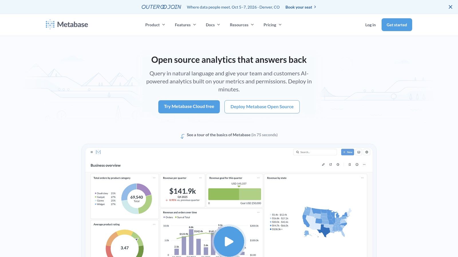
A common reporting phase looks like this: one analyst, a handful of SQL queries, a growing set of stakeholders, and constant requests to "just send this every Monday." Metabase fits that stage well. It gets scheduled reporting in place quickly without forcing a small team into a long BI rollout.
Best for simple reporting stacks and fast deployment
Metabase is usually the right call when speed matters more than formal governance. Teams can connect a database, build dashboards, set up email or Slack delivery, and give non-technical users a query builder they can use. Self-hosted deployment also appeals to companies that want control over infrastructure without buying a large enterprise platform.
That simplicity is the main advantage, and the main constraint.
Metabase handles recurring reports, alerts, embedding, and lightweight self-service well. It does not give you the same level of semantic control, permission design, or cross-team metric standardization that larger traditional BI platforms are built for. If finance, sales, and product all define core metrics differently, Metabase will expose that problem rather than solve it.
I usually place Metabase in the traditional BI category, but at the lightweight end of it. It is a better fit for operational dashboards and early reporting automation than for large-scale governed analytics programs. Teams that are still defining what should be measured often benefit from that lower overhead. Teams that already know they need strict metric consistency across many business units usually outgrow it.
Strong fit: Startups, internal ops teams, and mid-market companies that need scheduled reporting fast.
Less ideal: Organizations that need a tightly managed semantic layer, complex access controls, or heavily standardized executive reporting.
What to expect: Quick setup, broad usability, and more pressure on the data team once reporting logic starts to sprawl.
That category distinction matters in this article. Metabase is easier to adopt than many legacy BI tools, but it is still a dashboard and query-based product, not a modern spreadsheet-style warehouse interface and not an AI-native reporting layer. If the job is to automate a straightforward reporting workflow quickly, Metabase is a practical option. If the job is governed metrics at enterprise scale, or natural-language answers with less report building, another category will usually fit better.
You can compare deployment options on the Metabase website.
7. Mode by ThoughtSpot

A common reporting bottleneck looks like this: analysts build recurring SQL queries in one tool, document findings in another, then paste results into slides or dashboards for stakeholders. Mode reduces that handoff work by keeping SQL, notebooks, and report distribution in the same environment. For analyst-led teams, that matters more than a long feature list.
Best for analyst-led reporting workflows
Mode fits teams where reporting starts as analysis before it becomes a scheduled deliverable. Analysts can explore data, test logic, annotate results, and turn that work into recurring reports without rebuilding everything in a separate BI layer. That workflow is especially useful in product, growth, and marketplace teams where the first version of a report is rarely the final one.
The trade-off is straightforward. Mode is easier to love if your company already has strong SQL ownership. It is less comfortable for organizations trying to push self-service reporting to a wide group of non-technical users who want guided exploration, spreadsheet-style modeling, or natural-language answers. In the category framework for this article, Mode sits closer to traditional BI built for analysts than to modern data stack tools built around warehouse-native business workflows, and far from AI-native tools that reduce report-building effort altogether.
That difference affects rollout. Mode can improve analyst throughput quickly, but it does not remove the need for data team judgment on metric logic, query quality, or report design. If the issue is analyst backlog, that is a reasonable trade. If the issue is executive teams asking for answers without waiting on SQL, another category will usually fit better.
Good match: Data teams, product analytics groups, and companies where analysts own recurring reporting.
Less ideal: Broad business-user environments that need highly guided self-service or a strong semantic layer for metric consistency.
What to expect: Faster path from exploratory analysis to scheduled reporting, with adoption tied closely to analyst skill.
Mode is strongest when reporting automation means automating the analyst workflow itself, not just sending dashboards on a schedule.
You can evaluate plans and capabilities on the Mode website.
8. Preset

Preset is what I recommend when a team likes Apache Superset's open-source foundation but doesn't want to become a BI infrastructure operator. That's a common position. Running open-source analytics tooling sounds cheap until upgrades, alerting, permissions, and production reliability land on your engineers.
Best for teams that want Superset without running Superset
Preset adds the operational layer many teams need: managed hosting, upgrades, scheduled reports, alerts, and a cleaner path into production use. It preserves the open-source lineage while removing a lot of the day-two maintenance burden. That's valuable if your team wants flexibility but not another system to babysit.
The limitation is that you're still inside the Superset ecosystem. If you need the smoothest business-user experience or a highly opinionated semantic workflow, you'll feel those edges. Preset is strongest when your team values openness and charting flexibility more than polished non-technical self-service.
A good way to think about Preset is as an operations decision, not just a feature decision. You're choosing managed BI infrastructure instead of self-managed BI infrastructure. That distinction matters more over time than it does in the demo.
You can review managed Superset options at Preset.
9. Databox

A VP asks for a Monday morning scorecard, the marketing lead wants campaign pacing in Slack, and nobody wants to wait on a sprint cycle. Databox fits that situation well. It gets stakeholder-facing reports live quickly, especially when the inputs come from common sales and marketing systems.
Best for business scorecards and quick stakeholder visibility
Its value is speed to visibility. Connectors, prebuilt templates, scheduled reports, mobile-friendly dashboards, snapshots, and Slack delivery make it useful for teams that need recurring updates with minimal setup. For revenue and marketing reporting, that can be enough to solve the actual problem.
The trade-off shows up once metric logic gets messy. Databox works well for packaging KPIs and distributing them widely, but it is not the product I would choose to manage complex semantic definitions across finance, product, and operations. If your reporting stack depends on heavily modeled warehouse logic, tools in the modern data stack category usually hold up better.
That makes Databox a strong fit for one slice of the report automation market. Traditional BI tools are often heavier than this use case requires. AI-native tools like Querio solve a different problem entirely by helping teams ask new questions and work from governed data conversationally. Databox is strongest when the job is clear, repetitive, and stakeholder-facing.
That is a legitimate use case.
I recommend it for companies that need polished scorecards fast and can accept some limits around modeling depth and cross-functional governance. If the main goal is to keep executives, sales managers, and marketers aligned on a stable set of business metrics, Databox does that job well.
The product site is Databox.
10. Holistics
A familiar reporting failure looks like this: finance wants pixel-perfect scheduled packs, operations needs files pushed to an SFTP server before 6 a.m., and the data team wants metric definitions managed in Git instead of copied across dashboards. Holistics is built for that kind of environment.
Best for teams that need governed reporting operations
This platform stands out when recurring reports are part of a controlled workflow, not just a dashboard sent on a schedule. Its semantic modeling layer, Git-based development, dynamic variables, and delivery options support teams that treat reporting as a production system. The dbt alignment also matters. If your warehouse models already define business logic, this tool fits that operating model better than lighter dashboard tools.
That strength comes with a clear trade-off. This platform asks for more structure from the team using it. Analysts and analytics engineers usually appreciate that because it reduces metric drift and makes changes easier to review. A small company with one generalist marketer building weekly KPI dashboards may experience it as overhead.
This puts Holistics firmly in the modern data stack category of this guide, rather than traditional BI or AI-native tooling. Traditional BI tools often win on broad familiarity and drag-and-drop adoption. AI-native products like Querio are better suited to fast ad hoc exploration and conversational access to governed data. Holistics is strongest when the reporting job is repeatable, modeled, and operationally sensitive.
What it does well: Combines semantic governance with scheduled and conditional report delivery.
Where it fits: Mid-market and enterprise data teams that already use warehouses, dbt, and version-controlled analytics workflows.
Where it struggles: Small teams that want the fastest path to simple dashboards and executive updates.
I recommend Holistics for organizations standardizing recurring reporting across departments and willing to accept some implementation discipline upfront. Product and pricing details are on the Holistics website.
Top 10 Report Automation Tools Comparison
Product | Core features | UX & deployment | Value proposition | Best fit | Pricing |
|---|---|---|---|---|---|
Querio (Recommended) | AI coding agents; file-system Python notebooks; reactive cells; transparent SQL/Python; direct warehouse execution | Hybrid code + AI chat; embeddable boards & APIs; versioned context for reproducibility | Dramatically faster reporting cycles; lower headcount; governed, auditable analytics | Mid-market teams needing fast, flexible self‑serve analytics and embeddable insights | Free get‑started tier; enterprise pricing on request |
Microsoft Power BI | Report scheduling, paginated reports, data alerts, embedding | Deep Microsoft 365/Azure integration; Pro/PPU/Premium options | Strong governance and admin controls; competitive per‑user value in MS ecosystem | Windows/Azure‑centric enterprises and large orgs | Pro/PPU/capacity tiers; complex licensing matrix |
Tableau (Cloud/Server) | Rich visualizations; subscriptions; mobile delivery; flexible deployment | Cloud or self‑managed; Creator/Explorer/Viewer roles | Best‑in‑class viz and large community; strong content lifecycle tools | Enterprises focused on visualization and flexible deployments | Role‑based licensing; can be costly at scale |
Looker (Google Cloud) | Central semantic model (LookML); scheduled deliveries; APIs | Warehouse‑native; strong embedding & programmatic workflows | Consistent metrics at scale; excellent governance | Enterprises needing reusable metrics layer and embedded analytics | Custom enterprise pricing |
Sigma | Spreadsheet‑style live queries; bursting; conditional exports; pixel‑perfect layouts | Familiar spreadsheet UX over live warehouse data; scheduling & automated actions | Fast analyst/business user adoption; powerful personalized delivery | Analysts and business users on cloud data platforms | Pricing via sales (not publicly listed) |
Metabase | OSS + cloud; scheduled emails/alerts; simple query builder; embedding | Quick setup; cloud or self‑hosted; AI‑assisted querying | Low entry cost; fast time to value; strong community support | Startups and mid‑market teams needing basic automation | Free open‑source tier; clear cloud pricing tiers |
Mode (by ThoughtSpot) | SQL + Python/R notebooks; scheduled reports; APIs & webhooks | Analyst‑first collaborative workspace; integrated visual explorer | Smooth analyst workflows mixing ad‑hoc analysis and automation | Data & analytics teams that blend notebooks and reporting | Sales‑led pricing (custom quotes) |
Preset (Managed Superset) | Managed Apache Superset; scheduled reports & Slack alerts; embedding add‑ons | Managed hosting and upgrades; open‑source lineage | Production‑ready Superset without infrastructure maintenance | Teams wanting Superset features with managed reliability | Free tier; paid plans and add‑ons for embedding |
Databox | Dashboards, Scheduled Snapshots, 130+ connectors, AI summaries | Fast implementation; many templates for non‑technical users | Rapid exec/marketing scorecards; clear plan tiers | Exec, marketing, sales and product teams needing quick dashboards | Clear plan tiers; higher usage may increase cost |
Holistics | Semantic layer; Git versioning; scheduling with conditional delivery; dbt integration | Admin‑friendly scheduling; narrative Canvas dashboards | Strong governance + delivery controls; dbt/Git‑first workflows | Data teams prioritizing governed scheduled reporting | Published pricing tiers; targets data teams |
Traditional BI vs modern data stack vs AI-native
The biggest mistake in tool selection is comparing everything in one flat list. These categories solve different problems.
Traditional BI
Power BI and Tableau sit here. They're strong when you need broad dashboard adoption, polished interfaces, enterprise administration, and familiar procurement patterns. They work well for centralized reporting teams and established executive reporting cadences.
Their weak spot is that they can separate reporting consumption from the deeper data architecture. That isn't always fatal, but it becomes a problem when business logic sprawls across extracts, dashboards, and side spreadsheets.
Modern data stack BI
Looker, Sigma, Metabase, Mode, and Preset live closer to the warehouse. They usually assume your data platform matters, that modeling should be durable, and that reporting is one layer of a larger analytics system. For many scaling companies, that's the right mental model.
This category is often the best compromise. You get more governance and extensibility than lightweight dashboard tools, without fully shifting into an AI-native workflow. The trade-off is that these tools still depend on your team doing real data work well.
AI-native analytics
Querio is the clearest example in this list. AI-native tooling changes the interaction model. People ask questions directly. The system generates transparent code or query logic, and reporting becomes a byproduct of reusable analytical context rather than a static artifact.
This category is best when your bottleneck is analyst throughput and the business keeps asking questions that don't fit prebuilt dashboards. It's less about prettier reports and more about compressing the time between question and trusted answer.
How to choose the right report automation tool
A tool looks great in a sales demo when the data is clean, the metrics are already agreed on, and the use case is narrow. Real reporting environments are messier. Different teams define revenue differently, executives want scheduled packs, managers ask follow-up questions mid-meeting, and analysts still end up patching gaps in spreadsheets.
Choose for that reality.
The fastest way to narrow the field is to match the tool to your operating model, your data maturity, and the type of reporting work that creates the most friction today.
Start with four questions:
Who owns metric definitions? If a central data team owns them, choose a tool with strong semantic controls, versioning, and shared logic.
How stable are stakeholder questions? If leaders review the same KPIs every week, scheduled dashboards may be enough. If questions change constantly, you need a tool that supports exploration without creating metric drift.
Where does trust fail today? If teams already dispute the numbers, report automation will only distribute confusion faster. Fix the logic layer first.
What are you automating? Scheduled delivery, self-serve analysis, embedded reporting, warehouse-based modeling, and AI-assisted question answering are different jobs. One product rarely handles all of them equally well.
That framing also maps well to the three categories in this article.
Traditional BI tools such as Power BI and Tableau fit companies that need polished dashboards, broad business adoption, and predictable reporting cadences. Modern data stack tools such as Looker and Sigma fit teams that want reporting tied closely to warehouse logic and reusable models. AI-native tooling such as Querio fits teams where a primary bottleneck is analyst bandwidth and the business keeps asking for answers that do not fit into a fixed dashboard structure.
A simple shortlist usually looks like this:
Choose Power BI or Tableau if procurement, executive familiarity, and conventional BI workflows matter most.
Choose Looker, Sigma, or Holistics if durable metric logic in the warehouse matters more than dashboard polish alone.
Choose Metabase or Preset if you need lower-cost reporting, faster setup, or open-source alignment.
Choose Mode by ThoughtSpot if analysts drive reporting and SQL-first workflows are still the center of gravity.
Choose Databox if the main requirement is lightweight scorecards for business stakeholders.
Choose Querio if your backlog is driven by repeated business questions and you need governed self-serve answers, not just scheduled report delivery.
One practical rule helps avoid expensive mistakes. Buy for the constraint, not the aspiration. If the current pain is executive distribution, do not buy an AI workflow platform. If the pain is inconsistent business logic, do not solve it with prettier dashboards. If the pain is endless ad hoc requests, adding another static reporting layer will not reduce analyst load.
Migrating from legacy reporting without breaking trust
Migration fails when teams rip out old reports before proving parity on the numbers people care about. Reporting isn't just a technical system. It's a trust system.
What usually works
Move in layers. Start by identifying the reports that consume the most analyst time and create the least strategic value. Those are the best automation candidates. Leave politically sensitive executive reporting alone until the new platform has already earned credibility elsewhere.
Then separate report distribution from report architecture. If you only recreate emailed dashboards in a new tool, you'll keep the same brittle logic with a nicer interface. Build shared metric definitions first, then migrate the delivery patterns.
Migrate the logic before you migrate the screenshots.
It's also worth being realistic about the payoff curve. Some automation projects disappoint because they only automate the visible output layer. The harder work is usually in staging, modeling, governance, and self-serve design. Teams that accept that upfront make better tool decisions and avoid replacing one reporting backlog with another.
When an AI-native tool is the better choice
AI-native analytics isn't automatically the best option. Sometimes a conventional BI stack is the right answer. But there are clear signs that an AI-native system like Querio is the better fit.
Your analysts are acting like a help desk. Stakeholders ask many legitimate questions that never make it into a dashboard backlog. Metrics exist, but people don't know where to find or apply them. Product and business teams need answers inside workflows, not just in a BI tab.
That is where AI-native report automation tools change the equation. Instead of asking the data team to build every view manually, you give users a governed way to interrogate the warehouse directly. The key word is governed. If the AI layer hides logic, you'll create a new trust problem. If it exposes SQL, code, and reusable context, you can scale access without losing control.
Querio is strongest in exactly that gap. It gives non-technical users a direct path to answers while preserving the technical scaffolding data teams need to maintain quality. That's a better fit than legacy BI when the company has outgrown static dashboards but doesn't want self-serve analytics to turn into chaos.
The Final Takeaway: Automate Reports, Accelerate Decisions
The point of report automation isn't sending more emails on a schedule. It's reducing the distance between a business question and a trustworthy answer. If your team automates the last mile only, you may save some manual work, but you won't change how decisions get made. If you automate the reporting system from the data model through delivery, you create a powerful advantage.
That's why these tools shouldn't be treated as interchangeable. Power BI and Tableau are still solid choices for organizations that need familiar enterprise BI with strong distribution and admin controls. Looker, Sigma, Holistics, Metabase, Mode, and Preset make more sense when the warehouse is central and reporting should sit on top of a broader data platform. Databox is useful when visibility and speed matter more than deep modeling. Querio stands apart when the reporting challenge is really an access and throughput challenge. It shortens the path from question to analysis to published insight.
Organizations often don't fail due to selecting a poor product. Instead, their failures frequently stem from prioritizing presentation over an effective operating model. A beautiful reporting interface won't fix inconsistent metric logic. A powerful semantic layer won't help if business users still need an analyst for every simple question. An AI assistant won't help if nobody has defined the company's core concepts clearly enough for it to reuse.
Choose the tool that matches how your company works today, and how you want it to work next year. If your environment is centralized, compliance-heavy, and already tied into a major enterprise stack, traditional BI may be the smartest move. If your company runs on a warehouse and wants governed flexibility, modern data stack BI is usually the better route. If your team is overloaded by ad hoc demand and trying to turn analysts from report builders into infrastructure owners, AI-native analytics is worth serious attention.
The best report automation tools don't just save time. They reassign human effort to the work that matters. Analysts stop chasing distribution lists and rebuilding the same cuts. Leaders stop waiting on queued requests. Teams spend less time assembling status updates and more time acting on them. That's the true return.
If you're evaluating report automation tools and want a platform that combines self-serve AI, transparent SQL and Python, warehouse-native execution, and embeddable reporting workflows, take a closer look at Querio. It's a strong fit for teams that have outgrown static dashboards and need a governed way to scale analytics without turning the data team into a human API.

